Heat Map using HighCharts
This page describes how to create a heatmap using Highcharts widget
The 'heatmap' is a vscode project with Heatmap implemented using High Charts charting library. This project is a custom widget and can be integrated into view standard libraries.
To use Heatmap widget a user needs to have HighCharts developer license and you may need OEM license for distributing to the your customer.
Follow the below steps to use Heatmap widget in view standard widgets.
- Download the zip file from the above link
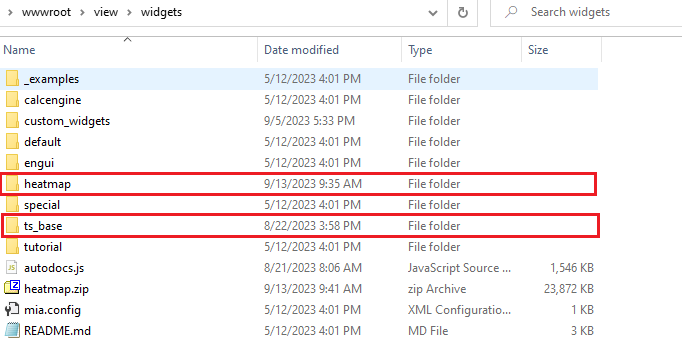
- Unzip the file 'heatmap.zip' into C:\inetpub\wwwroot\view\widgets folder
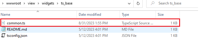
- Download and extract the file contents in tsbase.zip to C:\inetpub\wwwroot\view\widgets\ts_base folder and replace them with files from the zip file.
Now, restart the Vtrin Server service for the new widget changes to take place.
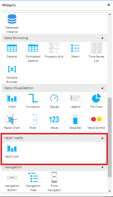
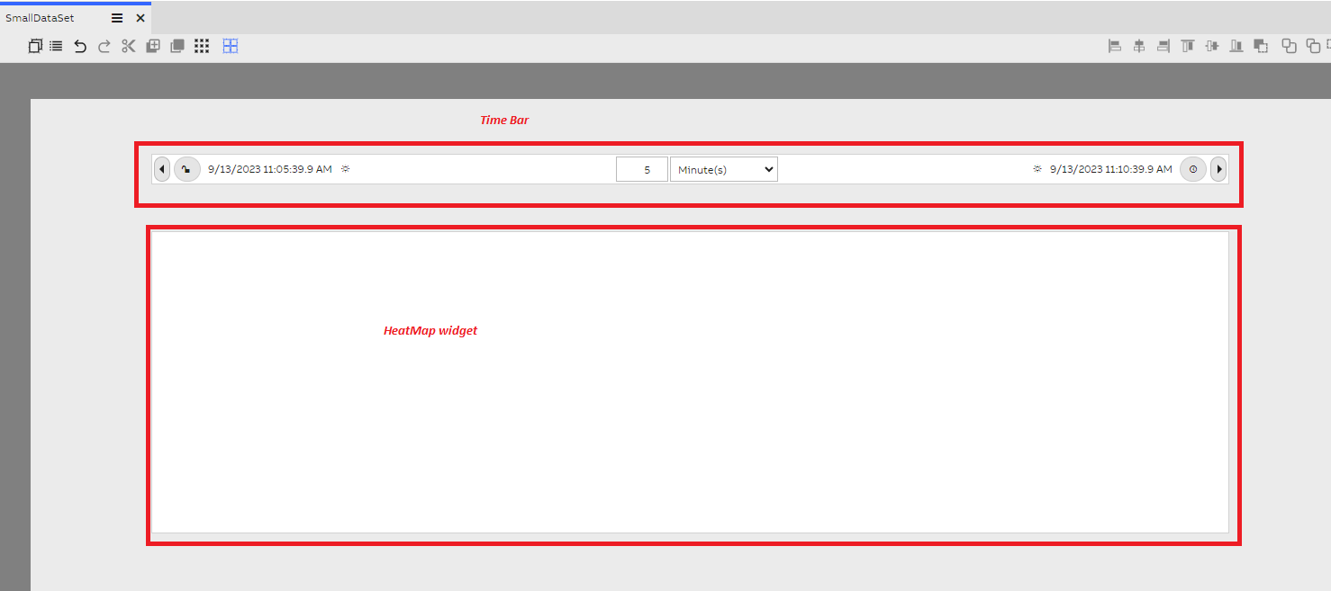
Open the view application and create a new dashboard, and switch to edit mode. On opening the widget library, user can see a custom widget called 'HEAT MAP' in the 'HEAT MAPS' section as shown in the below screenshot.
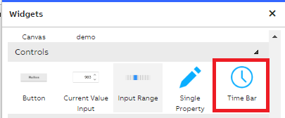
Drag the HEAT MAP widget to the dashboard and resize it to Height as 500 and Width as 500 (this is just for an example, user can select the desired height and width based on the data size for plotting). And also drag and drop a timebar widget from 'controls' section
Align the Time Bar and Heat Map widgets properly in the dashboard as shown in the below screenshot.
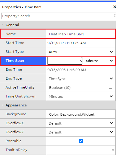
Give a name for the Time Bar as 'Heat Map Time Bar 1' and set the Time Span as '5' Minute (as we wanted to get small data set for the heat map plotting). And also disable the time synchronization to avoid automatic data refresh.
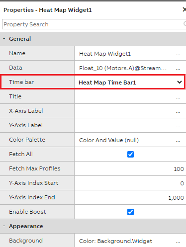
Select the Heat Map widget and name the Heat Map widget as 'Heat Map Widget1'.
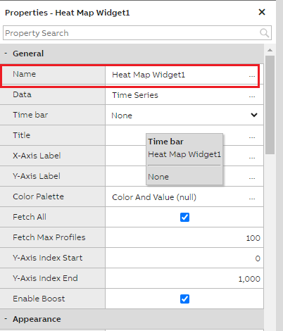
Click on the ellipses in the Data property to select the Graph Data Accessor properties. And it opens up Data Accessor popup modal window to configure the required Variables/Equipment properties.
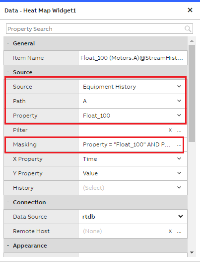
In the Data Accessor, selected the following details and closed it.
Source: Equipment History
Path: A (Equipment Instance Name)
Property: Float_100 (This is of Float 64 bit array data type and the data updates for every 1 second, the heat map best works with Array data types)
Next, in the Time Bar dropdown select 'Heat Map Time Bar 1' as heat map widget needs to be linked with Time Bar widget to fetch the data for the duration selected.
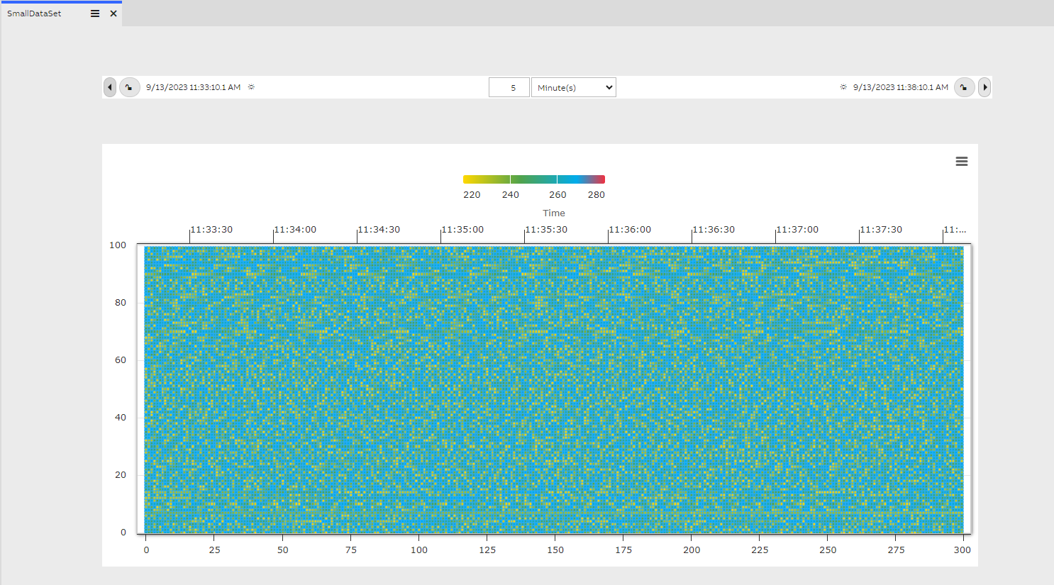
After selecting the Time Bar as 'Heat Map Time Bar1', immediately Heat Map widget plots the data as shown in the below screenshot.
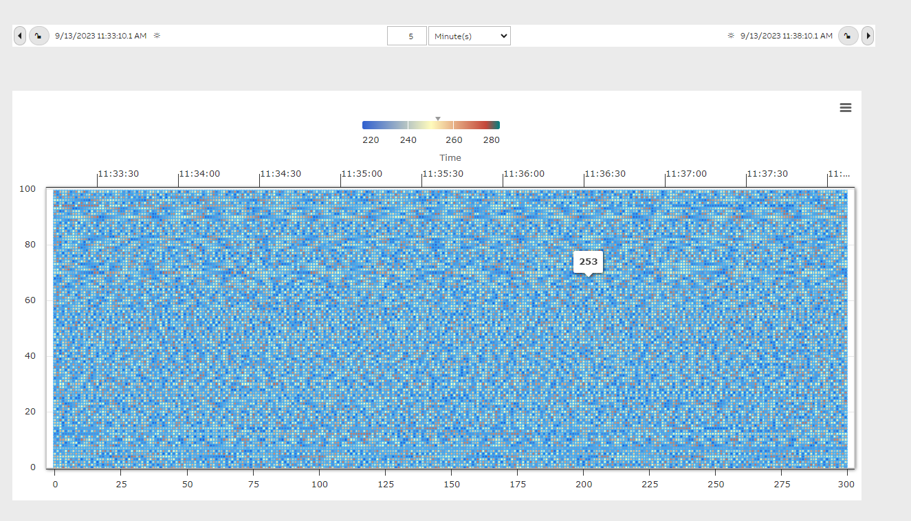
The X-Axis on the bottom of the widget represents the number of graph points fetched for the duration of 5 minutes as selected in the Time Bar, and X-Axis on the Top of the widget represents the time span/time interval slices based on the duration selected(5 minutes duration is sliced for every 30 seconds and the time slices are automatically determined by Highcharts to plot in the heatmap) in the Time Bar.
The Y-Axis represents the Array Length of the Float_100 equipment property, this property is of type 'Array of Floating Point Values (64bit)' with Max Array Length of 100. The values are updating for every 1 second for this Equipment property.
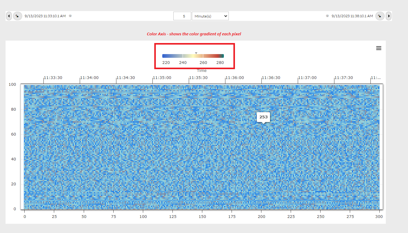
Each pixel or box in the heatmap widget represent the actual value from the Equipment Property and the color of each box is determined by the color gradient as shown in the Legend at the top of the widget. Minimum and Maximum values in the array are determined and the default color gradient is applied automatically. Also when user places mouse over any pixel the value of that pixel/box is shown as a tool tip. In the below heat map we have 300 profiles on the X-Axis and 100 points on the Y-Axis i.e. totally 30,000 heat points are plotted over in the area of the heat map widget.
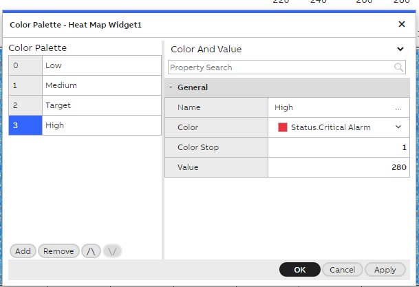
Addition to that if user wanted to have their own color gradients we have a widget property called 'Color Palette', clicking on the 'Color Palette' opens the below pop up as shown in the screenshot.
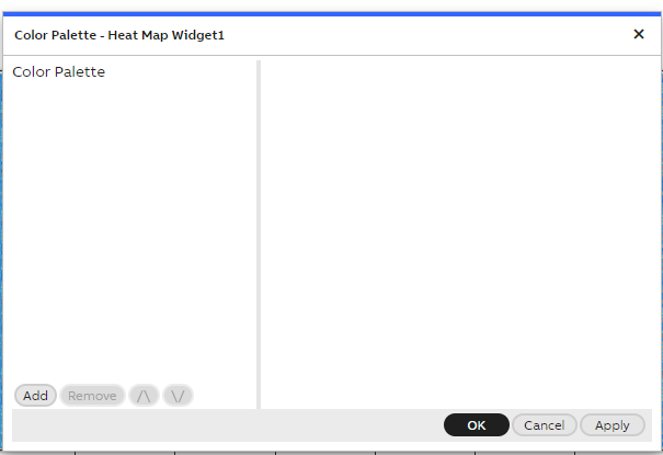
User can add required number of color gradients by specifying the required details. Click on Add button will add a new record.
Name: Can be any string ex: Low
Color: Yellow
Color Stop: This is the gradient value and it ranges between 0 to 1. Color stops are the colors you want to render smooth transitions among. This value consists of a color value, followed by an optional stop position (a percentage between 0% and 100% or a length along the gradient axis). Provided 0 here for Low.
Value: The Lower data point in the array for representational purpose ex: 220
Similar to the above added 2 more records as shown the below screenshot. Adding the Color Palettes overrides the default colors used in the Heatmap. After Color Palettes are added, save the dashboard and reopen for the changes to take effect.
Once the Dashboard is re-opened user can see that Color Axis legend on the top is updated with the new color gradient and also the heat map pixels/boxes colors are updated as shown in the below screenshot.
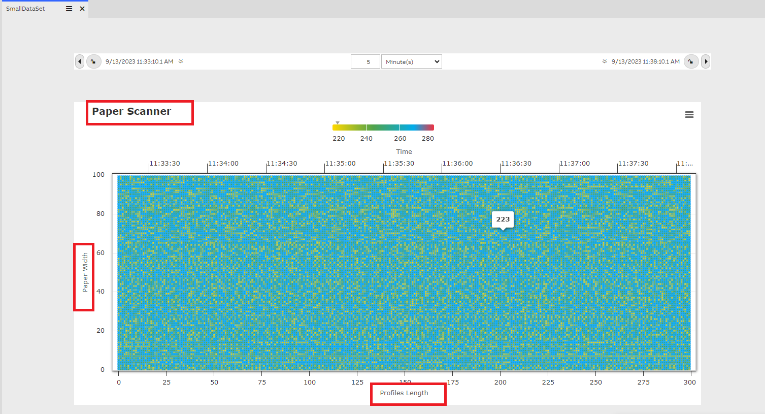
User can further add customizations to the heatmap with below properties as shown in the screenshot. Update the values for these properties and save the dashboard, reopening the dashboard will shown the changes.
Title: Every heat map widget will be given a title to show in the heat map and will be displayed in the widget.
X-Axis Label : This is shown on the bottom of the Heat Map
Y-Axis Label: This is shown on the Y-Axis as a label
Fetch All : Checkbox, by default it's selected when user creates a new dashboard. enabling this will Fetch all the available profile points during the specified duration. For example if we have 1000 data points for a duration of 1 hour, then all the points are used for the Heat Map plotting.
Unselecting the Fetch All checkbox will enable 'Fetch Max Profiles' textbox, the default value is always set as 100. In this case when there are 1000 profile points for the specified duration then only 100 profile points are fetched for the Heat Map plotting.
Y-Axis Index Start - Y-Axis Index End , these properties determines the index start and end of the array values. For example if a user is interested in plotting the data available between index of 50 to 60 from the array then these properties can be used.
Enable Boost - By default this option is enabled in the heatmap widget.
The Boost module is a stripped down renderer and a set of data handling modifications for Highcharts. It bypasses some of the standard Highcharts features, applies some trade-offs and focuses on handling and rendering as many data points as possible as quickly as possible. It renders the data using WebGL on a canvas inside the chart's SVG structure.
If the dataset is large then enabling the Enable Boost checkbox loads the Heat Map quick and gives better performance. Usually heatmaps plots large datasets like rending 1 million data points in the heatmap without boost causes slow rendering. Enabling the Enable Boost checkbox renders the large dataset in a faster way.
Updated 9 months ago