Dashboard Editor
Introduction
The View dashboard editor window is the main tool for creating and editing dashboards. It contains a frame, within which the widgets placed on the dashboard reside. Separate widgets are recognizable by their gray outline.
Toolbar
The top bar contains a set of additional tools as follows, starting from the left:
- Widget Library
- Contains the widgets installed in the system, including a default set. The widgets can be dragged and dropped onto the dashboard.
- Open Widget Tree
- Visualizes the parenting hierarchy of the dashboard's widgets.
- Undo, Redo
- These buttons respectively undo and redo the last operations performed on the dashboard. These can also be used via the hotkeys Ctrl-Z and Ctrl-Y.
- Cut, Copy, Paste
- Tools to copy or move widgets within the dashboard or onto other dashboards. Correspond to the hotkeys Ctrl-X, Ctrl-C and Ctrl-V.
- Enable/Disable Grid
- Displays or hides a grid that can be used as a helper when positioning widgets on the dashboard.
- Enable/Disable Snap Lines
- When enabled, the editor snaps widgets while moving to align with other widgets on the dashboard, allowing a clean and consistent structure.
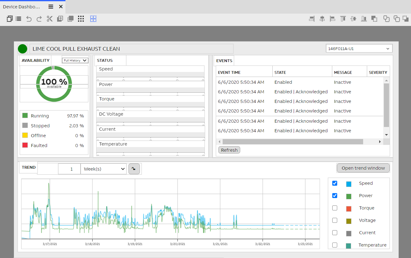
The above dashboard, presented in edit mode.
Controls on the right side:
- Align left/center/right/top/middle/bottom
- While having multiple widgets selected, these buttons can be used to quickly align the widgets with each other. Multiple widgets can be selected by clicking them while holding down Ctrl.
- Send to back/Send backward/Bring forward/Bring to front
- These buttons can be used to reorder selected widgets on the depth axis, in situations where multiple widgets overlap.
Placing and sizing widgets
A widget is the basic display element for building dashboards. These dynamic, interactive and often interoperable objects can be used alone or as a part of larger collection of visual objects to visualize data in its different forms. View contains a selection of native widgets ranging from labels and panels to data lists and charts, but it is also possible to create custom widgets for more specialized use.
Widgets can be placed on the dashboard by opening the Widget Library window from the toolbar and dragging the desired widget onto the dashboard. The new widget is automatically selected (other widgets can be selected by clicking on them). A selected widget displays sizing and scaling controls along its edges.
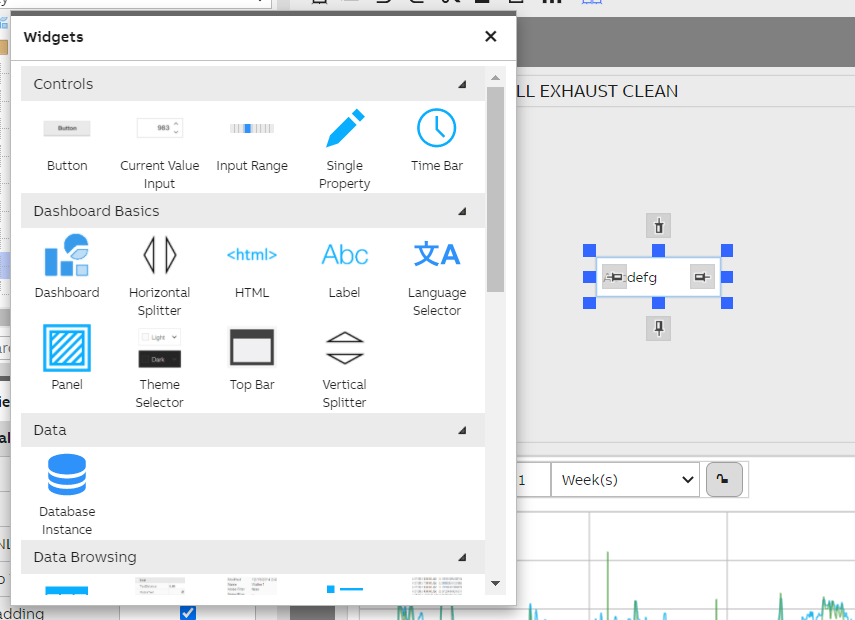
A simple Label widget has been dragged onto the dashboard.
The widget can be moved on the dashboard by dragging it from the middle. It can be resized by dragging the blue handles around it. The gray boxes on each edge are used for constraining the widget, which is explained in more detail shortly.
Keyboard controlsIt is possible to move and resize widgets also with the keyboard. You can move the widget by pressing the arrow keys. By holding Ctrl, you can do this with one-pixel accuracy. You can resize the widget by holding Shift while using the arrow keys. Holding Ctrl also increases precision for resizing.
If the snap lines are enabled, they are used when manipulating widgets with the keyboard.
Widget propertiesA selected widget's properties can be seen in the Properties window. From here, it is possible to fine-tune the widget's position and size with numerical controls, as well as further define the widget's appearance.
It is also possible to name a widget, which helps in keeping your dashboard's structure organized.
Dashboard editor layout engine
View support two layout engine: rubber layout and block layout. Rubber layout is the default one, it is the layout that is being used the most when creating a dashboard. In order to change the layout of the dashboard you need to do as follows:
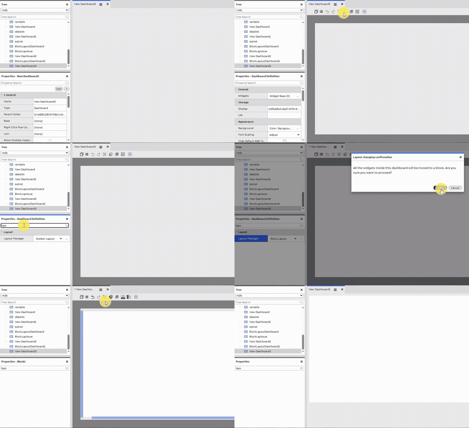
Changing the dashboard layout manager
Here is the step by step:
- Click the hamburger menu on the dashboard tab
- Click edit mode, you will then enter editing mode of the dashboard
- On the property grid, you will see "Layout manager" option, which will shows you list of available layout on the dropdown. Right now, we have only two (rubber layout and block layout), but we might have some other layout engine available in the future.
Below you will see detailed explanation of each layout and how they differ.
Rubber layout
Rubber layout is the layout that gives the most flexibility in how you want to position the widgets in your dashboard. You can also configure how each widget should be positioned relative to other widgets. At the heart of rubber layout is the anchoring mechanism. The anchoring mechanism is how widgets on a dashboard can have constraints on each edge, represented by a symbol inside a gray square that we talked about earlier. These are the basic tools for defining how your dashboard behaves on different window sizes and device displays. By properly configuring these, your dashboard adapts to the device it is being viewed on. Additionally, your dashboard may contain splitters that allow the user to manually resize its contents as needed. There are three different types of constraints, through which you can rotate by clicking the symbol along the edge.
Pinning and parenting
When a widget's edge is pinned, with the edge having the pin icon, the the edge holds its relative position to its parent. By default, the parent is the dashboard itself. By right-clicking a widget and selecting "Make child of...", the user can select a new parent. The widget's pinned edges then hold their position relative to this parent widget.
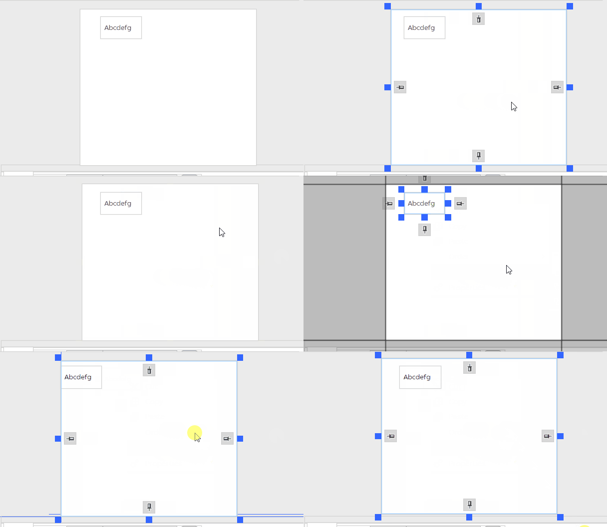
A pinned element moves along as its parent is moved.
More on parentingThe dashboard's parent-child-relationships can be viewed in the Widget Tree window in the toolbar. The parent can also be found in the widget's properties. If you delete a parent element, all of its children are also removed.
Anchoring
When a widget's edge contains the chain symbol, it is anchored to another element. The target element can be selected by dragging the chain symbol onto another element. A black line then displays the anchor connection between the two elements. An anchored edge keeps its distance (in pixels) to the target element.
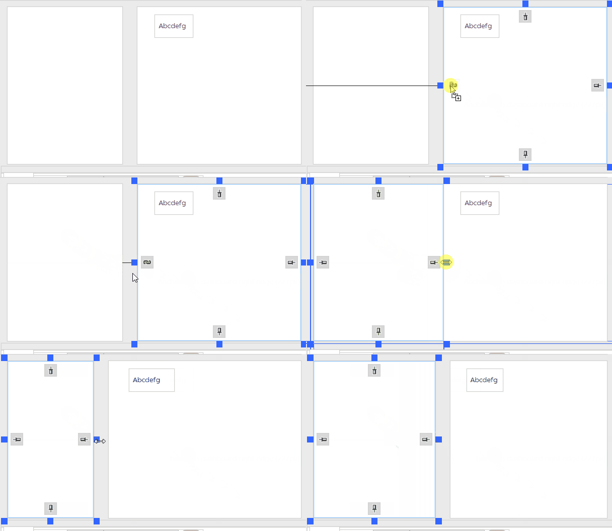
An anchored edge keeps its distance to the element to which it is anchored.
Floating free
When a widget's edge contains no particular symbol but just an empty box, it is floating free. A free-floating edge keeps a constant distance to the opposite edge of the widget – in other words, the widget maintains a constant width or height.
Auto-scaling font sizeSome widgets, such as Label and Property List, automatically adjust their font size depending on the window size. This can be used to ensure the text fits neatly on smaller displays. The limits for this can be adjusted in the attributes of the widget's Font property.
Block layout
Rubber layout win hands down when it comes to high freedom and flexibility on how you want to position you widgets. But it comes with a cost. This high flexibility means that you need to configure the positioning of all your widget manually by hand. This is okay if you have just a small amount of widgets. But with complex dashboard with lots of widget, this can be laborious. Block layout is solving that problem. Often time when creating a dashboard, you want to group your widget row by row. The rows can have variable height. Widgets from inside the row can't interfere with widget from another row. This is the main idea behind block layout. In this layout, we call that row as block. You can add ass many block as you want, thus, block layout dashboard does not have height constraint, unlike in rubber layout. You can have as tall dashboard as you want by putting the blocks and configure its height as you please. When viewing the dashboard, the user can then just scroll down to see the rest of the dashboard.
Widget addition, sizing and positioning
Widget addition behaves differently in block layout compared to rubber layout. There are two scenarios when you drop a widget:
- You drop a widget inside of an existing block, the dropped widget will then be automatically added as the child of that block. All its sizing and positioning will then be anchored to that block
- You drop a widget in empty area of the dashboard (outside of an existing block): in this case, a new block will automatically gets created and that widget will be made as child of this newly created block.
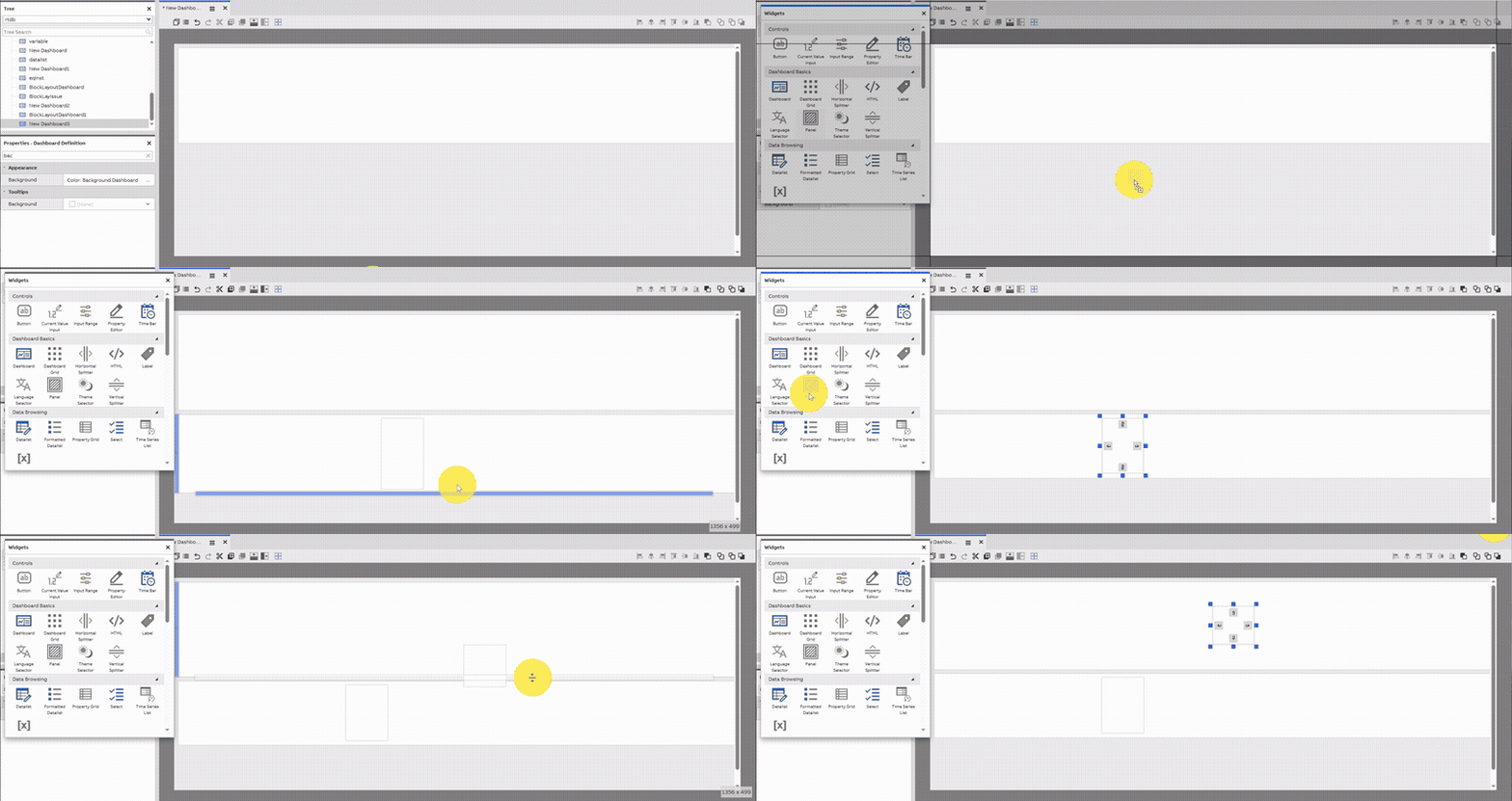
Dropping and positioning a widget in block layout dashboard
Block addition, sizing and positioning
A block, under the hood is actually just another widget. But its sizing and positioning is constrained. This constrain is actually the one thing that make block layout advantageous in some cases compared to rubber layout. A block has two constrain as follows:
- Block width, can't be adjusted because it will always take the entire width of the dashboard. You can only adjust the height of the block.
- You can't freely move block around. Instead, you can sort the block by moving them up and down the stack of blocks that you already have in your dashboard.
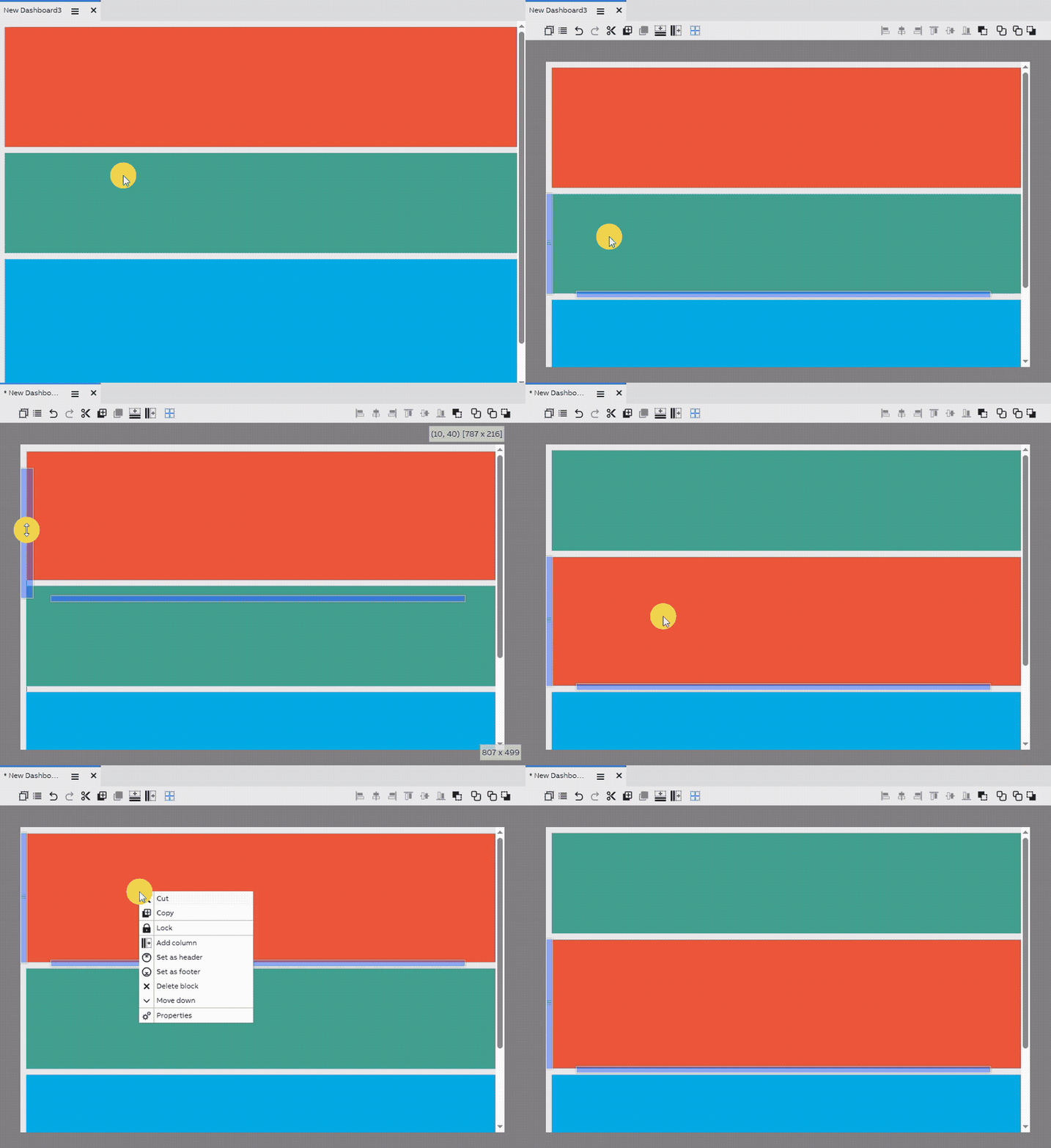
Block sizing and positioning
These two constraints help to make it easier to manage/arrange the widgets in your dashboard because they are all now automatically gets added into a solid block structure.
There are two ways to add block to the dashboard:
- Click "Add block to the top" icon on the dashboard editing toolbar. This will always add a new empty block to the top of the dashboard
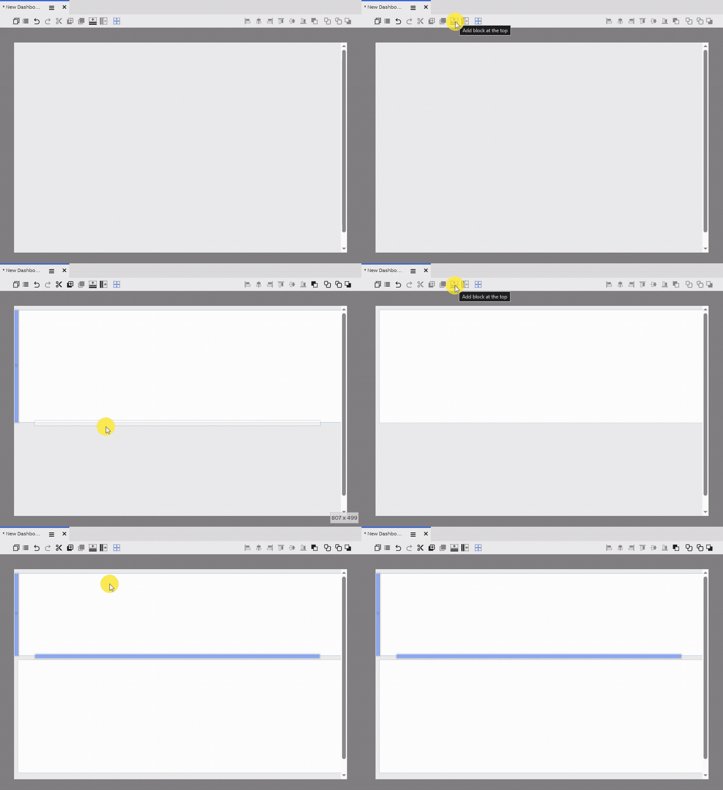
Adding a block at the top of the dashboard
- Right click anywhere on the dashboard during edit mode, and then click "Add block in here". This will add the block in position of the mouse cursor. If it is in between existing blocks, it will then push those blocks away to make room for this newly created one
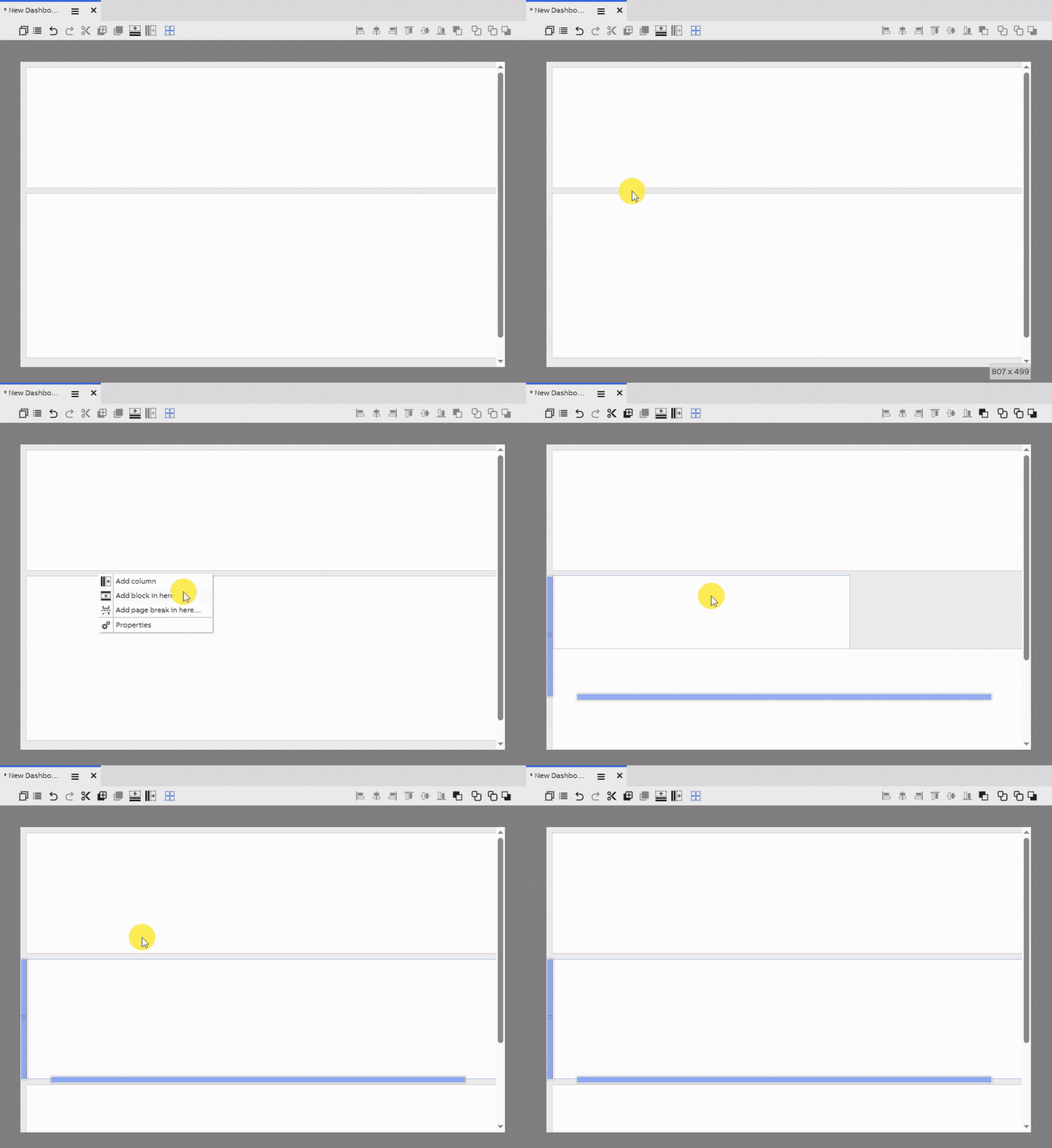
Adding a block in a specific position
Column addition, sizing and positioning
A block is a solid horizontal structure whose size and position is intentionally constrained for easier arrangement of widgets. In block layout, we also have column, which is the vertical counterpart of block. Columns can only be added inside a block. Equivalent to block, columns height will always take the entire height of its containing block. You can only adjust the width of the column. When it comes to its positioning, it is very similar to a block. You can't move it freely, you can only order its position within its containing block.
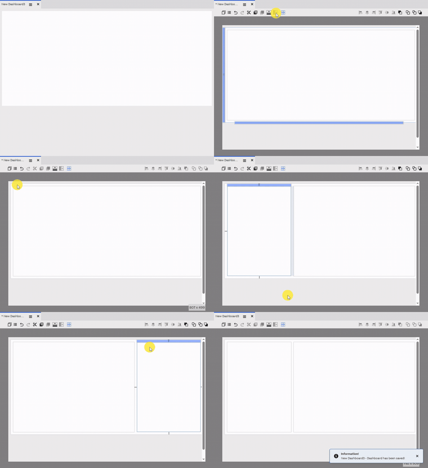
Columns addition, sizing and positioning
Layout conversionWhen converting from rubber layout to block layout, all existing widgets inside it will be a moved as a child a block that will automatically be created for all those widgets.
⚠️ Whereas converting from block layout to rubber layout will remove all its existing widgets, so this is a dangerous operation that really need to be considered heavily beforehand.
Snap lines and grid
The toolbar allows you to enable and disable the alignment grid and snap lines.
When the grid is enabled, it appears on the background of the dashboard, visible only in edit mode. When moving and resizing widgets, the edges try to snap to this grid. The grid cells' size can be customed with the Grid Rows and Grid Columns properties of the dashboard.
Likewise, when the snap lines are enabled, when moving and resizing widgets, the edges try to snap to the blue lines that extend along the edges of other widgets. This allows you to ensure all of your widgets are aligned.
Tips on positioning widgetsTry to ensure your widgets are positioned so that they align with each other, and so that different widget groups' corresponding elements, such as headers, are positioned uniformly. This makes your dashboard look clean and structured.
Editing multiple widgets at once
By holding Ctrl, it is possible to select multiple widgets at once. When you do so, moving and resizing a widget applies the same transformation to all selected widgets.
Alignment
When you have selected multiple widgets, it is also possible to utilize the toolbar's alignment buttons. Using these makes it easy to align sets of widgets uniformly. Note that the alignment buttons do not affect the widgets' dimensions, so widgets that are aligned to the left might have different lengths on the right side.
Managing your dashboard's space with splitters
A splitter is a widget that allows the dashboard's user to resize its contents without requiring entering edit mode. This allows the dashboard to adapt to situations where the data might not always have a uniform size, such as varying number of columns on a table, or where the user might want to view a wider swathe of time in a chart.
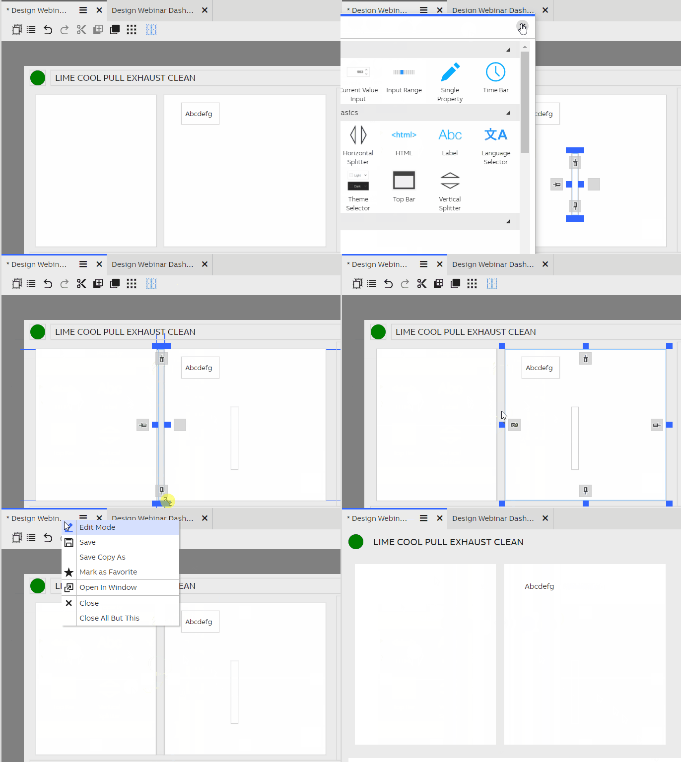
The steps to setup a horizontal splitter.
A splitter can be added by dragging it onto a dashboard from the Widget Library. There are both horizontal and vertical splitters. Position the splitter between two other widgets, and anchor the edges of both widgets to the splitter. Upon exiting edit mode, it is now possible to drag the splitter to resize the other widgets. Splitters, while invisible by default, can be recognized by the cursor changing to the resize cursor.
When you save the dashboard, the current position of the splitter is also saved.
Updated 7 months ago
