Dashboard step-by-step on View
On this page we show an example of how to build a comprehensive dashboard utilizing many view features
Introduction
On this page we will show two examples of constructing a comprehensive dashboard. The first example (Device Overview) will show how to display different device information with widgets and the second example (Device Fleet Overview) will show how passing information between different dashboards work.
Context
In this tutorial, we construct a system to monitor devices in a factory. Our user is an overseer, wishing to see how the factory's devices perform currently and how they have performed in the past. These devices, represented in our system as equipment, might be running, stopped, offline or faulted. In addition, they have properties such as speed, power, torque and temperature.
To monitor these devices, we construct two dashboards. We create a "Device Fleet Overview" dashboard to display a list of devices, and a "Device Overview" dashboard to view a single device's availability and history information.
Device Overview
Creating the Dashboard
Let's begin with the Device Overview dashboard. On this dashboard, our user wants to see two things: the availability information of the device, and a trend displaying its performance in the current moment and in the past.
First, we navigate to the dashboard editor. It can be reached at https://{your History url}/view. Open the Tree window, right-click on your desired folder and select New -> Dashboard.

Generally, when working with unfinished dashboards, avoid creating the dashboard in a folder where it is available to your end users in the production environment. If only you need to edit the dashboard, it is safe to create it in the User's Definitions folder. It is private and only available to you.
Remember that it is a good practice to let your users test your dashboard even before it is fully finished. This way you can more easily make adjustments, if your users have ideas on how to improve the dashboard.
Now we have created the first dashboard. Open it, and right-click on the tab. Select "Edit Mode". This brings you into the dashboard editor. More information on the features of the dashboard editor can be found on the page Designing a Dashboard; from here onwards we assume you are familiar with it.
Structure of the Dashboard
Next we prototype the basic structure of the dashboard in the editor. The information we want to see here are:
- A way to select which device we are displaying
- A way to show the selected device's name
- A way to show the selected device's availability information
- A way to show the history of the device's properties as a trend

A design mockup for the device overview dashboard. Creating this kind of UI mockup makes it easy for you to convey your ideas to your users.
Let's put these four components into place.
Selecting the Device
As a prerequisite to showing any data on the dashboard, we need to know which device we are displaying on it. For this, we can use the Select widget.
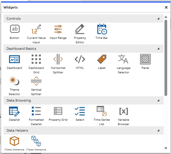
Widget library example
Drag the Select widget from the widget library onto the dashboard, and position it in the top right corner. This puts it in an easy-to-find location, but does not make it the most important information on the dashboard. We reserve that for the main header.
Open the widget's properties, and name the widget as "DeviceSelector". This makes it easier to refer to it later.
In this widget, we want to have all of our devices as options. In this particular system, the devices can be found as instances of the class Path_ABB.Drives.ACS880. Select this as the "Source" of this select. Now we have all our device instances as options in this dropdown menu. You can confirm this by exiting edit mode and clicking on the selector. Pick any device from this list, to provide us data on the dashboard.
Displaying the Device's Name
The top left corner is the usual location for a dashboard's main header. In the main header of this device overview dashboard, we want to show the selected device's name. Drag a Label widget onto the dashboard, and position it in the top left corner. Resize it horizontally so that it can fit even long device names. Name it as "MainHeader".
The header's text should be large and emphasized. Use the Font property to increase its size and to give it a bold weight. The default white background does not look good against our dashboard's default background color, so use the Background property to turn it transparent.
Next, we want to show the device's name as the text. This is done via context, which is explained on the page Dashboard Features. Via the "Listen to Context" property, make the header listen to the device selector's context. The label then automatically displays the selected equipment's name.
Sections for Availability and Trend
Let's create the containers for the availability and trend sections. These are of similar level of importance to our users. We are going to present availability as a pie chart, which carries significant visual weight, so let's put it on the top and the trend with lesser visual weight on the bottom. They could also be positioned next to each other horizontally, but since the trend benefits from added horizontal width, let's make them horizontal.
Add two panels onto the dashboard. Position them on top of each other vertically so that each fills almost the entire width of the dashboard and half of the height of the remaining empty space. Use the snap lines in the editor to ensure that they align. Name the top one "AvailabilityContainer" and the bottom one "TrendContainer".
Availability Section
Let's first build the availability section. Availability is displayed as a set of percentages, which correspond to the states "Running", "Stopped", "Offline" and "Faulted". These add up to 100%. Pie chart seems like a great way to present these in a compact and visually clear way.
Widgets we will use on Availability section:
- Label: We use label for the header. Drag a new label onto the dashboard, and snap it to the top left corner of the AvailabilityContainer panel. Name it "AvailabilityHeader", and set the text content as "Availability". To style it to look like a proper header, increase the font size a couple of steps and make it bold. You can also use the "FontTransform" attribute of the Font property to make it uppercase. This way you can keep the content capitalized correctly but still render it as all-uppercase. Right-click on the header and parent it to the AvailabilityContainer.
- Pie chart: Drag the Pie Chart widget onto the dashboard, and position it so that it fills the left half of the AvailabilityContainer. Name it "AvailabilityPieChart" and parent it to the container.
- Pie chart legend: Add a Legend widget on the right side of the container, name it "AvailabilityLegend" and parent it to the container. Use the Legend property of the pie chart to bind the legend to it. We'll format the legend a bit later, when we have data showing in the pie chart.
Hierarchy of the dashboardRemember that you can ensure that your dashboard has a correct hierarchy from the Widget Tree menu, in case you forgot to do some parentings.
Modifying context on pie chart
Now we can try showing data in the pie chart. Make it listen to context from the DeviceSelector dropdown. Now exit edit mode and try to switch to another device from the dropdown.
As you can see, this is not quite enough to make the data show up in the pie chart, because the pie does not automatically know what to display. To do this, we need to define some value accessors. These can be manually created in the Items property of the widget, but we can use a shortcut here.
Find a device instance in the Tree window that belongs to the same class as the devices we want to view on this dashboard. Select it, and find its properties in the Properties window. From here, you can simply drag the desired properties onto the pie chart widget. This automatically generates value accessors for those properties. The properties we want are "RunningFullHistory", "StoppedFullHistory", "NotConnectedFullHistory" and "FaultedFullHistory".
Now the pie chart should display these four properties. As the widget is already listening to context from the DeviceSelector, changing the device here also updates the pie chart to show these properties from that device.
We still want to do some tweaks on how these are displayed. To do this, open the Items property of the pie chart. Here you can find the four value accessors. For each of these, select the three dots next to the Value Accessor property. In this menu, change the item names to be more readable by setting the Item Name property: "Running", "Stopped", "Offline" and "Faulted".
From here, we can also change the colors of these items. These colors should correspond to the user's expectations of what these states should be colored; "Running" is the wanted state so it should be green. "Stopped" is not running but it has not failed either, so let's make it yellow. "Offline" is out of order and is best displayed as gray. "Faulted" is an unwanted state, so let's make it red.
Press OK and return to the dashboard editor. Exit edit mode and select another device to refresh the data. The pie chart should now neatly show the states. The sections of the pie chart display tooltips that show the accurate values.
Modifying content shown on legend
The legend should now also be automatically filled. We can, however, simplify it more; the pie chart does not necessarily require the full legend. Return to edit mode and check the properties of the legend. From here, hide the legend's headers and borders. This already makes the legend look better in our use case.
Next we want to decrease the number of columns. From the Items list of the legend, remove everything except "Colour", "Display Name", "Pointer Value" and "Unit". Now our legend should be simple and clean, and show the states' colors, names and percentages.
"Running" is the most important of our states; it directly tells the user how high the device's availability has been. We want to put more emphasis on this, simply having it first in the legend is not perhaps quite enough. We also have unused space in this section of the dashboard, so let's put it into good use. Add a "Value" widget on top of the pie chart. Make it as wide as the pie chart, and name it "RunningPercentage". Parent it to the AvailabilityContainer. Make its background transparent, so it doesn't cover the actual pie chart. With this widget, we can display the "Running" value, emphasized in the middle of the pie chart. Make it listen to context from the DeviceSelector, and configure its Value Accessor the same way we did for "Running" in the pie chart. Increase its font size, bold it, and use the "Alignment" properties to align the text into the center of the widget. Enable the "Show Unit" property to make it display the percentage symbol. Now we have the Running percentage displayed neatly within the circle of the pie chart.
Trend Section
Now let's move onward to the Trend section. Use Ctrl-C and Ctrl-V to copy the Availability header and place a copy of it onto the Trend container; name it "TrendHeader" and parent it to the TrendContainer. Now our Widget Tree is starting to show a very structured hierarchy for the dashboard.
Widgets we will use on Trend section:
- Chart: drag a Chart widget onto the area and resize it so that it uses about a half of the horizontal space. Name it "TrendChart" and parent it to the container. Then we make the chart display data from the device. This can be done in the same way we filled the pie chart; find a device instance of the correct class in the Tree, and drag its properties onto the chart. The properties we want to see are named "AmbientTemperature", "MotorSpeed", "MotorTorque" and "MotorCurrent". As we did with the pie chart, find the value accessors in the Items list of the chart, and rename these items "Temperature", "Speed", "Torque" and "Current". You can also change the graph lines' colors in here. Now we have configured the data to display in the Trend. However, it still does not look very usable. We have no rulers so we don't know how the values fluctuate, and there is no way to select the displayed timespan. Let's add a couple more widgets.
- Chart Legend: Add a legend, and position it on the right side. Name it "TrendLegend" and parent it to the container. Attach it to the chart in the chart's properties. Let's adjust the legend a bit. Disable everything except colour, name and unit. This allows us to save some space, so we can make the trend a bit wider. We can also remove the header, and hide the borders as we did with the pie chart's legend.
- Time bar: Add a Time Bar widget. Name it "TrendTimeBar" and parent it to the container. This widget allows us to select a timespan to show in the chart. Decrease the chart's height so that the time bar can fit below it, and match their widths. Assign the time bar to the chart in the chart's "Time Bar" property. Now we can use this time bar to adjust the span of time shown in the trend.
- Rulers: Next we want to add rulers. Add a Ruler widget on each of these sides. Name them LeftRuler and BottomRuler, and parent them to the container. Attach them to the chart through its Left Ruler and Bottom Ruler properties. Now we can automatically see time in the bottom ruler, and the items' ranges in the left ruler.
If running out of space, give the Trend section a bit more space by adjusting the container sizes (making the Availability section a bit smaller). Adjust the chart's size and make some space on the left and bottom sides. The parenting of widgets makes adjusting quick and easy.
Adding a Splitter
Lastly, we can further improve the dashboard by adding a Horizontal Splitter widget between the Availability section and the Trend section. Adding splitter allows the user to adjust the size of these sections without using edit mode. Size the splitter so that it fits between the two containers, name it as you see fit and anchor the adjacent edges of each section to it. Instructions on how to configure a splitter can be found on the Dashboard Editor page.
Wrapping up the Device Overview
Now our Device Overview dashboard is finished! You can try switching between different equipment from the top right corner's selector, and see the contents of the dashboard update accordingly.
At this point you should show the dashboard to your users and see what they think of it. Improve it based on their feedback!
You should also make sure it works well with different screen sizes. You can use the constraints presented on the page Dashboard Editor to achieve this. At this point, when you know how much space each element of the dashboard takes, you can tweak their positions and sizes so that they have a logical hierarchy and look visually clean and consistent. Tips for this can be found on the page UI & UX Design.

Our finished device overview dashboard looks like this.
Device Fleet Overview
Next, let's dive into how passing information between different dashboards works. We can do this by creating another dashboard, a device fleet overview that displays every device in the factory. Conveniently, our device dashboard is formatted so that we can add it as a sub-dashboard on the device fleet overview dashboard.

A simple design mockup for the device fleet dashboard.
Creating the Dashboard
Create a new dashboard and name it "Device Fleet Overview". Open it in the dashboard editor.
Structure of the Dashboard
Our user wants to see a list of all devices in the factory, and see data related to those devices when clicking them in the list. Thus, the dashboard should contain both a list of devices and some information related to the selected device.
First of all, let's add a header. Add a label widget into the top left corner and name it "MainHeader". Set the content as "Device Fleet Overview", bold it, and increase its size.
Displaying all devices using a Data List
Add a Data List widget on the dashboard, and fill the left half with it. Name it "DeviceList". Next, we make it show all devices belonging to our factory. This is done in our case by setting the list's "Source" as "Path_ABB.Drives.ACS880".
This fills the list with a large amount of data. We need to prune this a bit to show what we need. Open the "Columns" property of the list and uncheck all except "Name", "Available" and "RunningFullHistory". These provide the at-a-glance information our user needs. "Available" shows the device's current status as a colored square and "RunningFullHistory" shows the device's availability in the past. Rename "RunningFullHistory" using the "Custom Name" attribute to be a bit more user-friendly: "Availability %".
Exit edit mode and resize the columns so that they fit in our available space. Save the dashboard. This also saves the column widths.
From the list's properties, we can also enable "Masking". This creates a field above the Name column that allows the user to search for specific items in the list. This is useful in cases where there are a lot of devices. The user can also sort the list by clicking on the headers, as long as the "Sorting" property is enabled. This allows the user to find the devices with the best or worst availability, or sort them alphabetically.
Showing a single device's information in a sub-dashboard
Next, let's allow the user to see a bit more information about a device when they select one from the list. Drag the Device Overview dashboard from the tree onto this dashboard. This creates a sub-dashboard. Resize it so that it fills the right side of the dashboard. Name it "DeviceDashboard" – a sub-dashboard does not inherit a name from the actual dashboard it's based on.
Now we have our previously created dashboard as a part of another dashboard. If you make edits to the original dashboard, they are reflected on this one. Because the Device Overview dashboard contains just a few widgets, it's reasonably sized to be used this way. Next we make this dashboard show data based on the device selected from the list.
Select the sub-dashboard and make it listen to context from the DeviceList widget.
However, the sub-dashboard does not yet know what to do with the context it receives from the data list. To do this, we need to define a context handler for the dashboard. Follow the instructions for passing context between dashboards, and add a context handler for the Device Overview dashboard. Set the handler's context class as "Path_ABB.Drives.ACS880", so it understands what to do with the device instances. As all widgets in the Device Overview dashboard bow to the DeviceSelector dropdown, select the DeviceSelector as the target of the context handler. This way the context gets passed on to this widget, which in turn passes it onto all other widgets on the dashboard.
Now selecting a device on the datalist updates the device overview on the right side of the Device Fleet Overview dashboard.
Wrapping up the Device Fleet Overview
Our Device Fleet Overview dashboard is now finished. Now we have both a device dashboard for monitoring single devices, and a device fleet dashboard to view them all.

Our finished Device Fleet Overview dashboard.
Further Improvement Ideas
It would be very convenient to be able to send a device from the Equipment Browser directly onto the Device Overview dashboard. We can configure this by following the Send To guide.
Further reading
- Creating sub-dashboards: Sub-dashboards can be used to embed dashboards within each other, which allows you to reuse complex widget constructs between multiple dashboards.
- Display inheritance: A concept where you create a base template for a display, and other displays can inherit all the widgets and layout from this base template.
- Display template: Useful tool for creating a shared base for multiple dashboards. It’s particularly helpful when creating several similar dashboards with minor changes.
Updated 6 months ago