Process Diagram
This example shows how you can create a process diagram that helps you monitor your factory systems. In this example, the data shown in the widgets comes from an equipment model, and the diagram visualizes historical values using a background image with value widgets, charts, and labels placed on top of it.
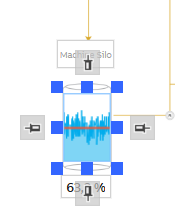
Example of a completed process diagram with background image, value widgets, charts, and labels placed in position.
Step 1: Designing the Background Image
Here are few things you should consider when you design a background image for dashboard that works in both light and dark themes, and scales to different screen sizes without losing quality.
1. Aspect Ratio
- Recommended: Use 16:9 aspect ratio (For example 1920x1080px or 2560x1140px).
- This works well on most screens and scales nicely in the dashboard.
2. Create the Image with a Vector Tool
- Recommended tool: Adobe Illustrator or any vector graphics editor.
- Vector images ensure lines and shapes remain sharp and consistent on all screen sizes.
3. Theme options
You can choose between two approaches:
- Separate images for light and dark themes: Use different background images to optimize contrast and readability for each theme individually.
- Single image for both light and dark themes: Design the image with colors that offer good contrast and visibility in both light and dark modes.
4. Layout planning
Plan the placement of widgets that will be added on top of the background image — such as title areas and the Time Bar — already during the image design. This ensures that the final layout feels complete and visually balanced.
Tip: Add labels as widgets in the dashboard rather than embedding them into the background image.
- Text will scale correctly with screen size.
- Text color will automatically adapt to the selected theme.
5. Image Format
-
SVG
- Sharp at all sizes: SVG does not blur because it’s a vector.
- In the dashboard properties, choose Maintain Aspect Ratio -> by Background Image — This ensures the background image keeps its original proportions instead of stretching or squashing.
-
If you want the SVG to stretch and compress like a PNG, add preserveAspectRatio="none" directly to the SVG element in your SVG file.
<svg xmlns="http://www.w3.org/2000/svg" width="100%" height="100%" preserveAspectRatio="none"> ... </svg>
To keep line thickness consistent when scaling, convert lines to shapes (outline stroke) before exporting.
-
PNG
- Transparent background: Especially important if the same image is used in both light and dark themes.
- Export in high resolution to avoid blurring when scaled — for example, at least 1920×1080 pixels (16:9 aspect ratio) or higher depending on your target screen size.
-
JPG (Not recommended unless transparency is not needed)
-
Use only for separate images for each theme, since this format does not support transparency.
-
Export in high resolution to avoid blurring when scaled — for example, at least 1920×1080 pixels (16:9 aspect ratio) or higher depending on your target screen size.
Testing
Resize test: Try the background image in the dashboard by adjusting the browser window size and switching between themes. This way you can observe how it behaves.
-
Example background image used in both light and dark themes. Designed with neutral gray for good contrast, with space reserved for title, Time Bar, and widgets aligned with process elements.
Step 2: Add the Background Image and Widgets
1. Set the Image as Dashboard Background
- Create new Dashboard and enter Edit mode.
- Go to the Dashboard Properties.
- Go to Appearance-> Background and open the property dialog from three dots.
- Select the image(s) as needed:
- If you are using the same image for both Light and Dark themes, select image under Background -> Image.
- If you want different images for Light and Dark themes, select one under Background -> Image (for Light theme) and another under Background - Dark -> Image (for Dark theme).
If no image is set under Background - Dark, the Light theme image will be used for both themes.
Example of background image settings with separate images for Light and Dark themes.
2. Add and Configure Widgets
You can use any widget in a process diagram depending on what you want to display. In this example, we use a limited set of widgets (charts, value widgets, and labels) to keep the scenario simple, but other widget types can also be added as needed.
Read more about widget types and their usageWidget Placement:
Place widgets on top of the correct process elements in the background image.
Important: Use pin anchoring on all four sides for every widget that must remain in a fixed position relative to the background image. This ensures that widgets scale proportionally and stay aligned when the screen size or resolution changes.
- Be precise with placement:
- Avoid placing widgets over the lines of background elements they are meant to be inside, as this breaks the visual illusion of integration with the background image.
Example of a chart widget with full pin anchoring maintains its exact position and proportion across different screen sizes.
Data Sources:
All widgets can use any available source class, depending on what kind of data you want to display in your process diagram.
Common sources:
- Equipment History - for historical values of equipment model properties
- Process History - for values of Variables
In this example, we show historical values from an equipment model, which is why both the chart and value widgets are configured to use Equipment History as their source.
Time Bar widget:
The Time Bar is used to define the time range for any widgets that display historical data.
- In our example we use default settings for Time Bar:
- End Time:
TimeSync(shows current time) - Start Time:
Auto - Time Span:
30 minutes
- End Time:
These settings allow you to view real-time data while also exploring historical data within a 30‑minute time window.
However, you can adjust the time span to match your monitoring needs. For example, a 1‑day range is often more typical for process monitoring.

Time Bar settings used in the process diagram.
If the dashboard only needs to show current values, the Time Bar should not be added.
Chart widgets:
Chart allows you to display graphs on your dashboard, and there are also other widgets available for visualizing data depending on your needs.
Configuration used in this example:
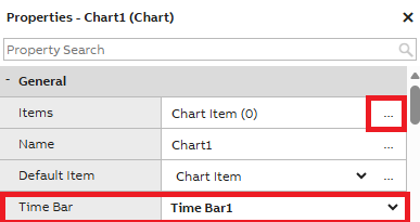
- Select the Chart widget and open the Properties panel.
- Go to General -> Items.
- Click the three dots to open the Items window.
- Items: Add new items by pressing Add at the bottom of the dialog.
- Source: Use the source that matches your data. In this example, we use Equipment History because we want to show historical values from an equipment model.
- Time Bar: In the Properties -> General -> Time Bar setting, choose the existing Time Bar to ensure the chart follows the selected time range.
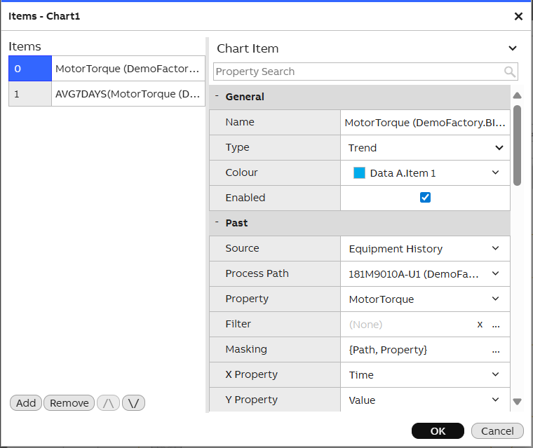
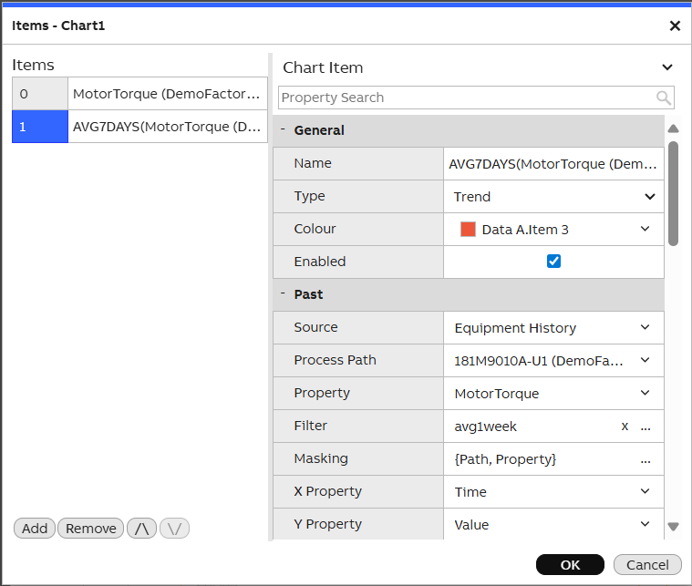
The chart items are configured using the Equipment History source. The first item shows historical values. The second item uses the AVG1WEEK filter to visualize the weekly average.
Value widgets:
Value widgets can display either real‑time values or historical values, depending on how the widget is configured.
Showing current values
If the dashboard only needs to show real-time values, use the Current Value accessor (default). In this mode, the Time Bar is not required.
Showing historical values
If you want the value to follow a selected time range, use the History Value accessor and link it to the Time Bar.
History Value uses Subscribe mode by default, which allows showing aggregated values (e.g., last 24 hours) even when the Time Bar is not used.
Configuration used in this example:
- Select the Value widget and go to the Properties panel.
- Go to General-> Data-> Value Accessor.
- Choose History Value from the dropdown.
- Click the three dots to open the Value Accessor Property window.
- Set the following:
- General -> Type:
Fetch– to retrieve the value linked to the Time Bar. - Source ->
- Source:
Equipment History - Path: Select the correct equipment instance
- Property: Choose the desired property
- Filter:
AVG– shows the average value for the selected time range.
- Source:
- Time -> Time Bar: Link the widget to the Time Bar
- General -> Type:
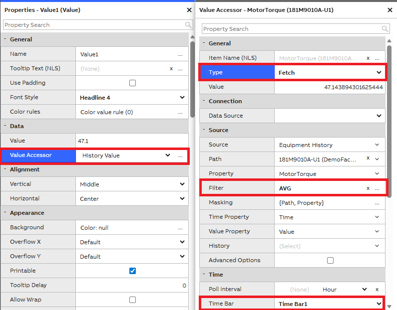
Example of Value Accessor configuration showing the most recent Equipment History value, synced with the selected time on the Time Bar.
- Optional presentation settings:
- Properties-> Presentation-> Show Unit: Display unit next to the value.
- Properties-> Presentation-> Decimals: Set to 1 for improved readability.
Label widgets:
Label is the simplest widget for displaying text on your dashboard.
In this example, labels are used for naming value widgets and for the main title of the process diagram. You can add any text fields needed for your own use case. Label colors adapt to the selected theme when theme colors are used, and the font scales with the window size depending on the pin anchoring settings.
Step 3. Test the Dashboard
After placing all widgets and setting the background image, save the dashboard and exit edit mode.
Test with Different Screen Sizes
Manually resize the browser window to simulate different screen sizes and ensure that:
- Widgets stay in their correct positions
- The background image scales properly and won’t get blurred
- Texts and charts remain readable and visually aligned
Test Time Bar Functionality with widgets
- Change the time span or select a different date using the Time Bar.
- Check that:
- Value widgets update correctly based on selected time.
- Charts show correct historical data for the selected time span.
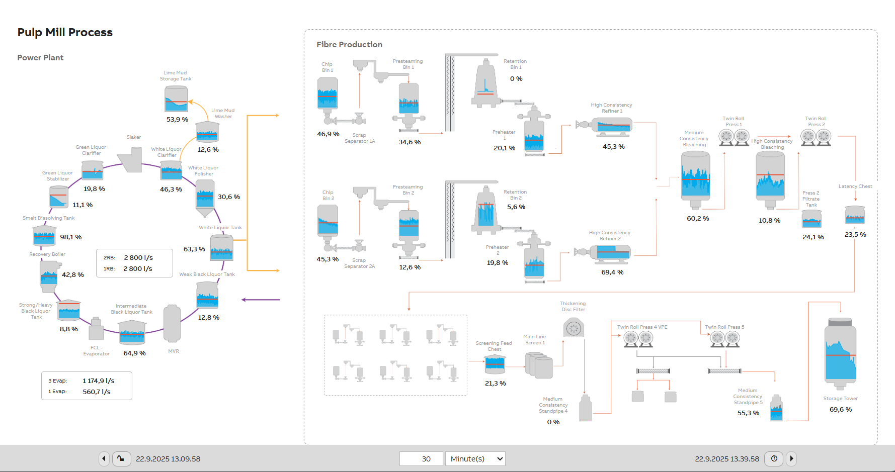
Process diagram shown in light theme. Colors and texts adapt automatically to match the selected theme.
Updated 3 days ago