Standard Widgets
Introduction
A widget is the basic display element for building dashboards. These dynamic, interactive and often interoperable objects can be used alone or as a part of larger collection of visual objects to visualize data in its different forms. View contains a selection of native widgets ranging from labels and panels to data lists and charts, but it is also possible to create custom widgets for more specialized use.
On this page, we will present some of the most common widgets you will find in the widget library.
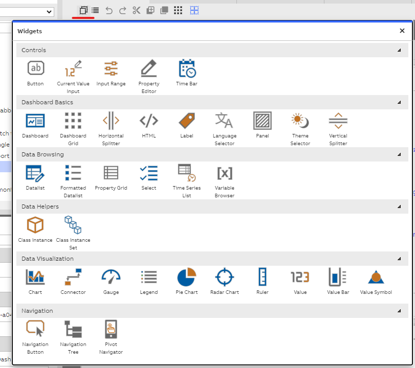
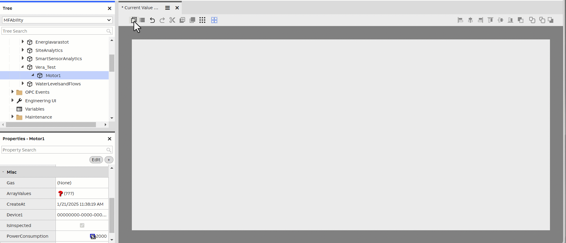
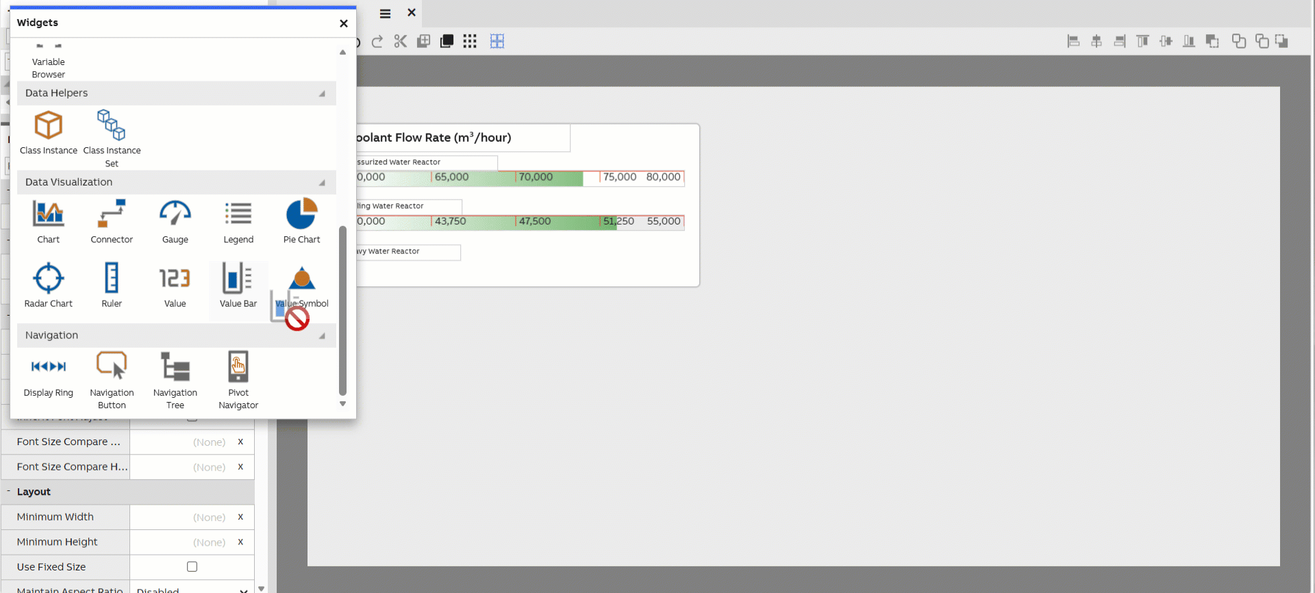
Widget library on view
Basics
Dashboard
The Dashboard widget can be used to insert another dashboard onto the dashboard as a sub-dashboard.
Dashboard Grid
First, create a sub-dashboard and add a full-size Value widget, ensuring it connects to the intended data source. Then, use the sub-dashboard’s context handler to bind it to the Value widget.
Next, configure the dashboard grid to listen to the context of the Class Instance Set, ensuring it continues to use the same data source as the Value widget on the sub-dashboard.
Finally, drag and drop the sub-dashboard into the dashboard grid to display the data. Multiple dashboard grids can be placed within the same dashboard to display data from different sources.
Panel
Panel is perhaps the most basic of widgets in the library. It provides a blank background, which can be used as a parent for other widgets. This allows you to create groups of widgets. You can adjust the widget's background color in its properties. (Note that changing the background is available for most other widgets too.)
The Panel widget serves as a container for structuring dashboard layouts.
Anchoring panels to splitter widgets allows the user to change the panel sizes.
Splitter (Vertical Splitter/Horizontal Splitter)
The Splitter widget allows your users to adjust the size of the dashboard's contents without needing to edit the dashboard itself. Instructions for its use can be found on the Dashboard Editor page.
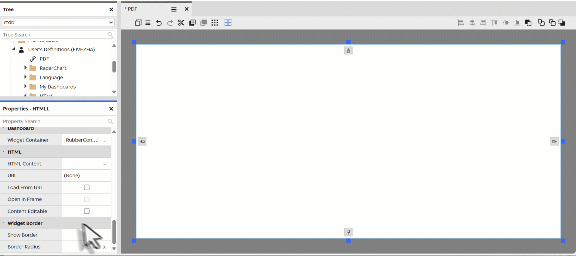
HTML
The HTML widget allows for the insertion of raw HTML content on your dashboard, enables the creation of highly customized reports, providing maximum flexibility in both design and functionality. They allow full control over the appearance of reports, seamless integration of interactive elements, and easy incorporation of external links.
The HTML widget also supports rendering PDF files located in the application root directory.
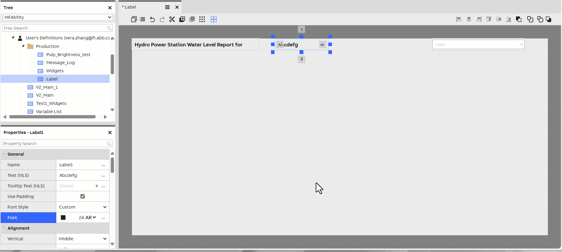
Label
Label is the simplest widget for displaying text on your dashboard. You can change the text content from the Text property of the widget. Label supports scaling the font size automatically based on the window's size. The limits for this can be configured in the Font property of the widget.
If the label listens to context, it displays the name property of the object in the context. More information on context passing under Dashboard features article.
The label widget also supports longer text format.
The widget also supports localization, see the callout below 👇.
Localization using NLS (Native Language Support)The UI SDK provides support for localization of strings in the user interface. Many widgets, such as Label, allow you to set their text content based on an NLS key.
Theme Selector
Theme selector lets you choose between light and dark theme.
Language Selector
Language selector lets you choose language. Please note that View needs reloading to corporate the language changes.
Controls
Button
The Button widget provides a simple button for your dashboard. It has multiple appearance settings in its properties, and allows you to set its text content in the Text property.
You can attach logic to your button by creating a dashboard script that listens to the button widget's Clicked event. For further information see our how-to example on scripting using button click event.
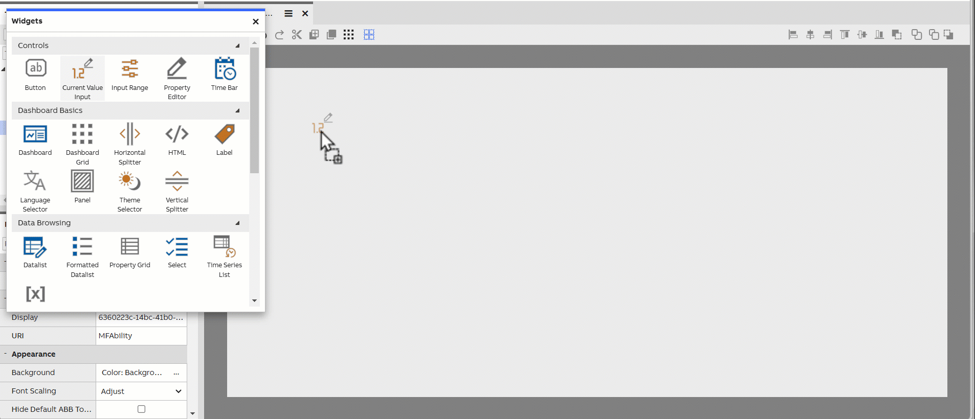
Current Value Input
The Current Value Input widget can be used for entering current values for a Variable or an Equipment Property. Please note that data may be added with "drag&drop" feature.
The Current Value Input either could be set via Value Accessor.
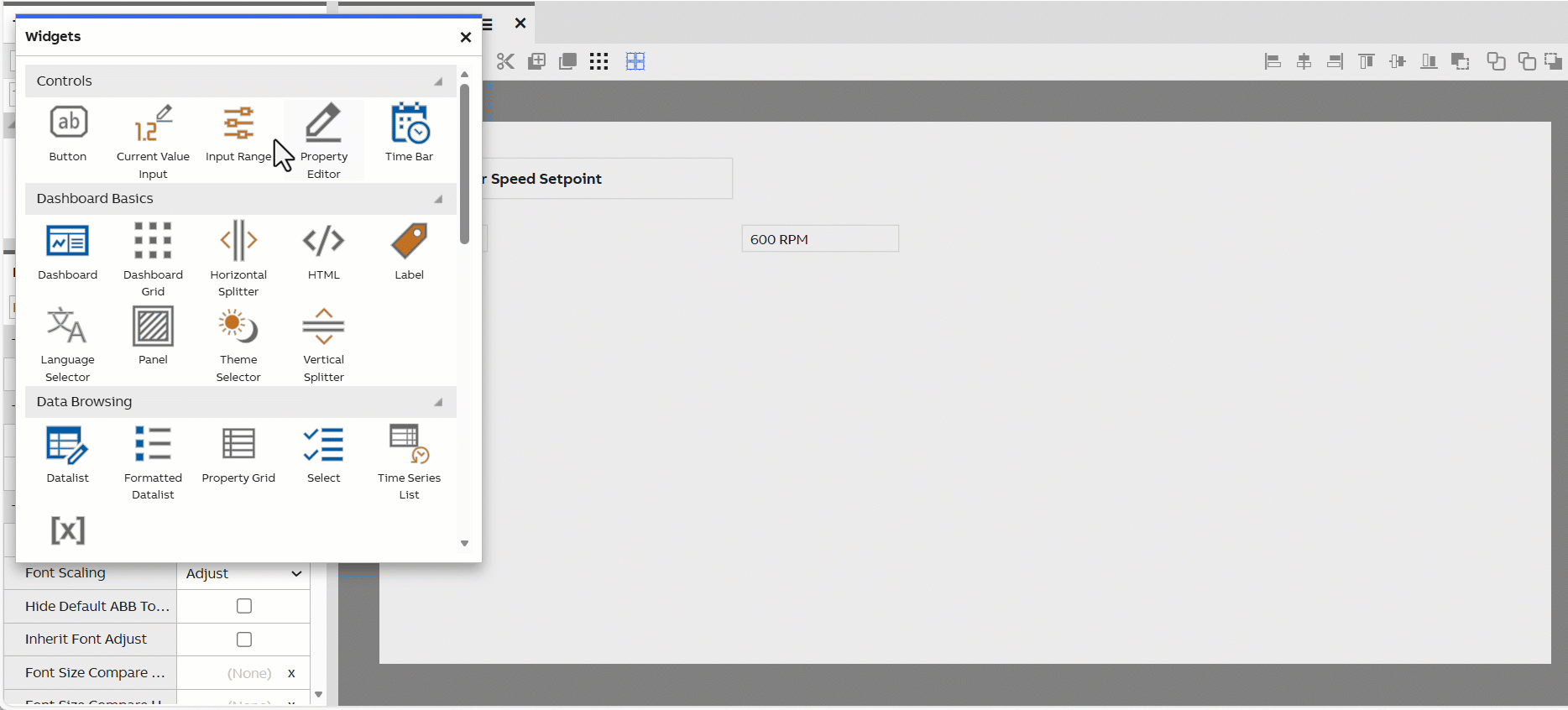
Input Range
The Input Range widget provides a slider that can be used to set the numerical value of a property. Its minimum and maximum values, as well as the length of a step (default 1) can be configured.
It is a Human-Machine Interface control widget designed to allow user to update the associated programmable logic controller setpoint. The Min, Max, and Step definitions should remain consistent with the corresponding parameters.
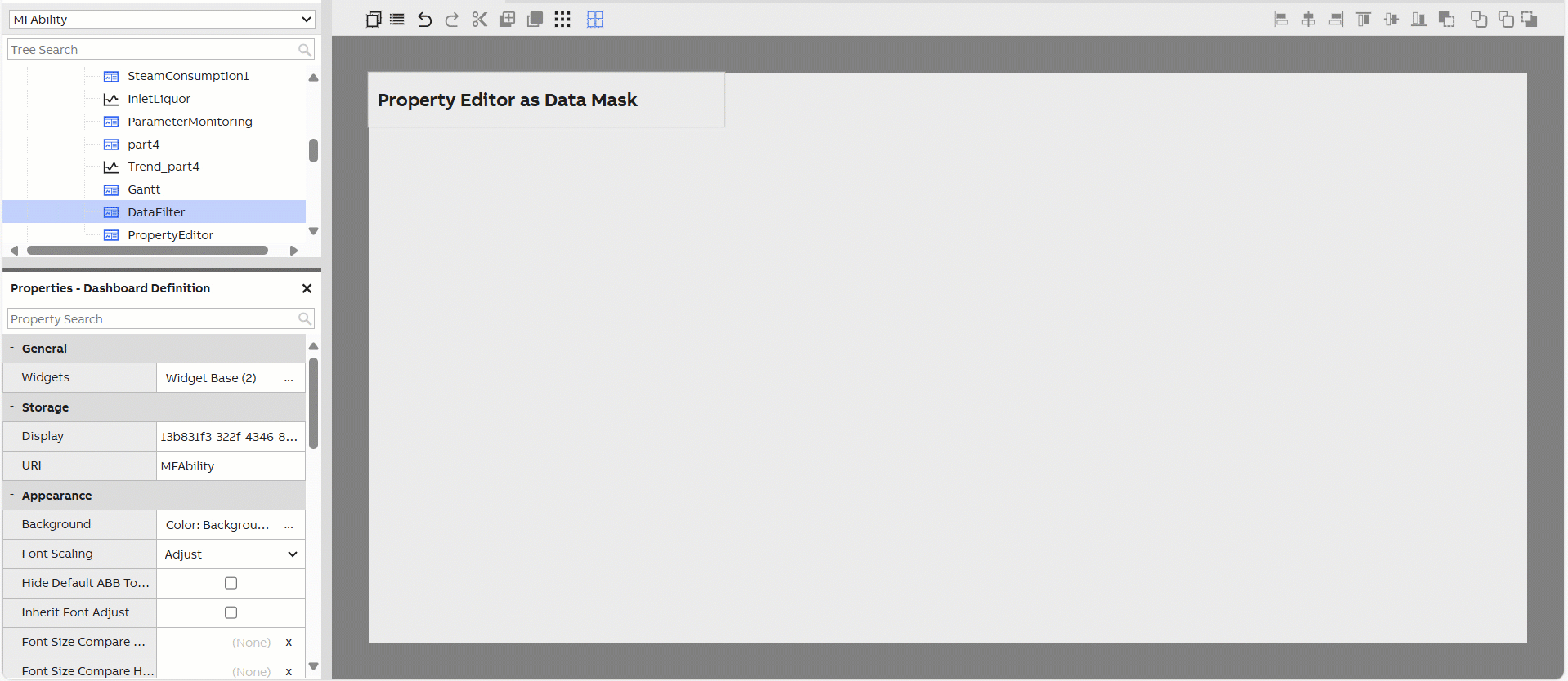
Property Editor
This is a widget that can be used for editing or showing properties in widgets or other components. It is configured by selecting a target component and a property to be edited. After selecting these, it will automatically assign a suitable editor for editing the property.
For complex property types (arrays, dictionaries, components, etc.), there is a launch button that opens a property editor window.
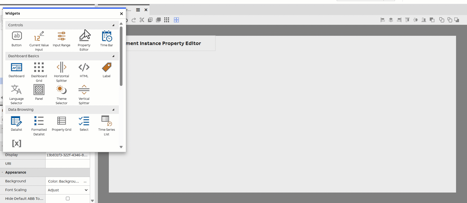
The Property Editor widget also allows users to mask data in data browsing scenarios.
Time Bar
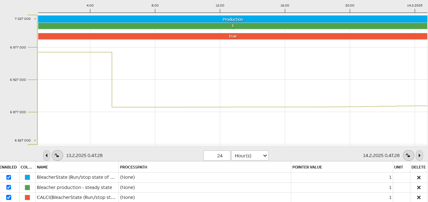
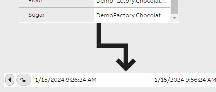
The Time Bar widget is a control widget for a time window. It allows the user to select a timespan. This timespan can be used by, for example, a chart to limit what is displayed on it.
It can be connected to a chart via the chart widget's properties. When connected, it synchronizes its time zone to the selected data source.
Data Browsing
Datalist
Datalist provides a grid to display data in rows and columns. It has a wide feature set, allowing you to:
- Select which properties of the data to show in the columns.
- Reorder and rename columns.
- Mask rows based on column values, including using wildcards.
- Export to CSV file. Exported file will have valid CSV file according to RFC4180, including all the necessary escaping. With additional formatting for array and object that is not part of that RFC.

A datalist can display many types of data in rows and grids.
Formatted Datalist
Formatted Datalist has many similarities with the default Datalist, but it is more focused on providing formatting options for the displayed data items and their layout. You are not restricted to the typical grid layout, and you can, for example, configure different font styles for different data properties. Long text content, for instance, may be well suited for the Formatted Datalist. It is perhaps not best suited for displaying huge number of items like the default Datalist.
Please see our Formatted Datalist configuration options tutorial for further information.
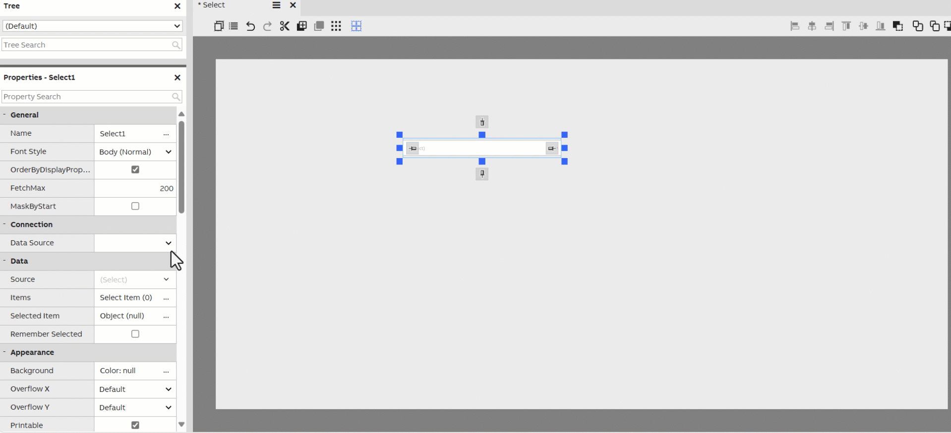
Select
The Select widget allows your user to browse a list of equipments in a dropdown menu and select one of them. The selected equipment can be passed through context for other widgets to use. Source to select widget may be configured on widget properties.
In scenarios where the users intend to access multiple data nodes, please first ensure the appropriate authorization permissions are granted. Then, review the NetSync mechanism for details on multi-node configuration and Networking systems using equipment publications.
Time Series List
The Time Series List widget allows for simple displaying of the values of a historized property; it acts as a grid-based alternative to the Chart widget. Like the Chart widget, it can be connected to a Time Bar.
Time Series List supports Vtrin Graph Data fetches and filters ( for example AVG1HOUR, MAX1DAY, CALC(y/100)). Please find further information on using filters under Time Series article discussing aggregates and filters with examples.
Property Grid
Property Grid can be used in showing and editing properties from a widget, a component or a database class instance. E.g. In dashboards a Property Grid widget can be set to listen to context from a Navigation Tree widget to show the properties of the selected item.
- Only properties with IsBrowsable/IsVisibleToUserByDefault attribute are shown.
- Edit/Commit/Cancel buttons are provided for database class instances.
- Provides a search box for filtering properties, tooltips and description for the selected property
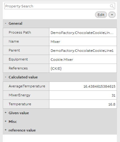
Example of a property grid widget appearance
Variable browser
Variable Browser can be used for browsing the Variable class (cpmPlus History, OPC drivers).
- Provides a Path tree for OPC convenience.
- Using Context events can provide the Variable selection to other widgets.
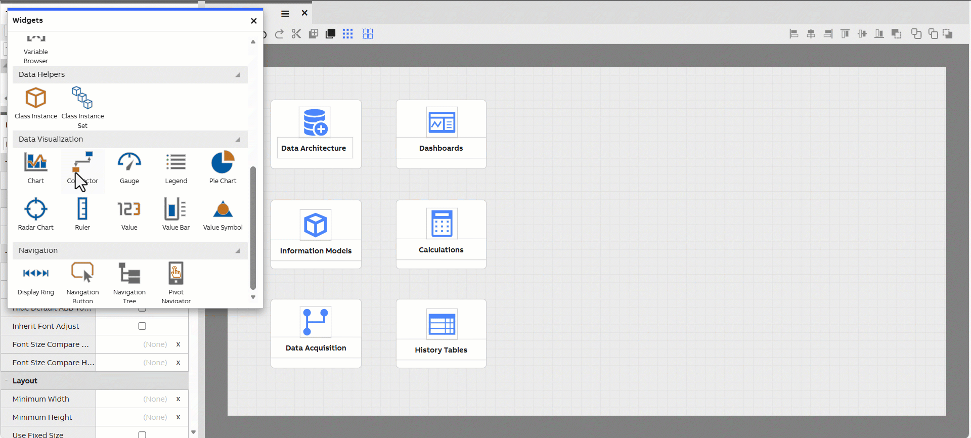
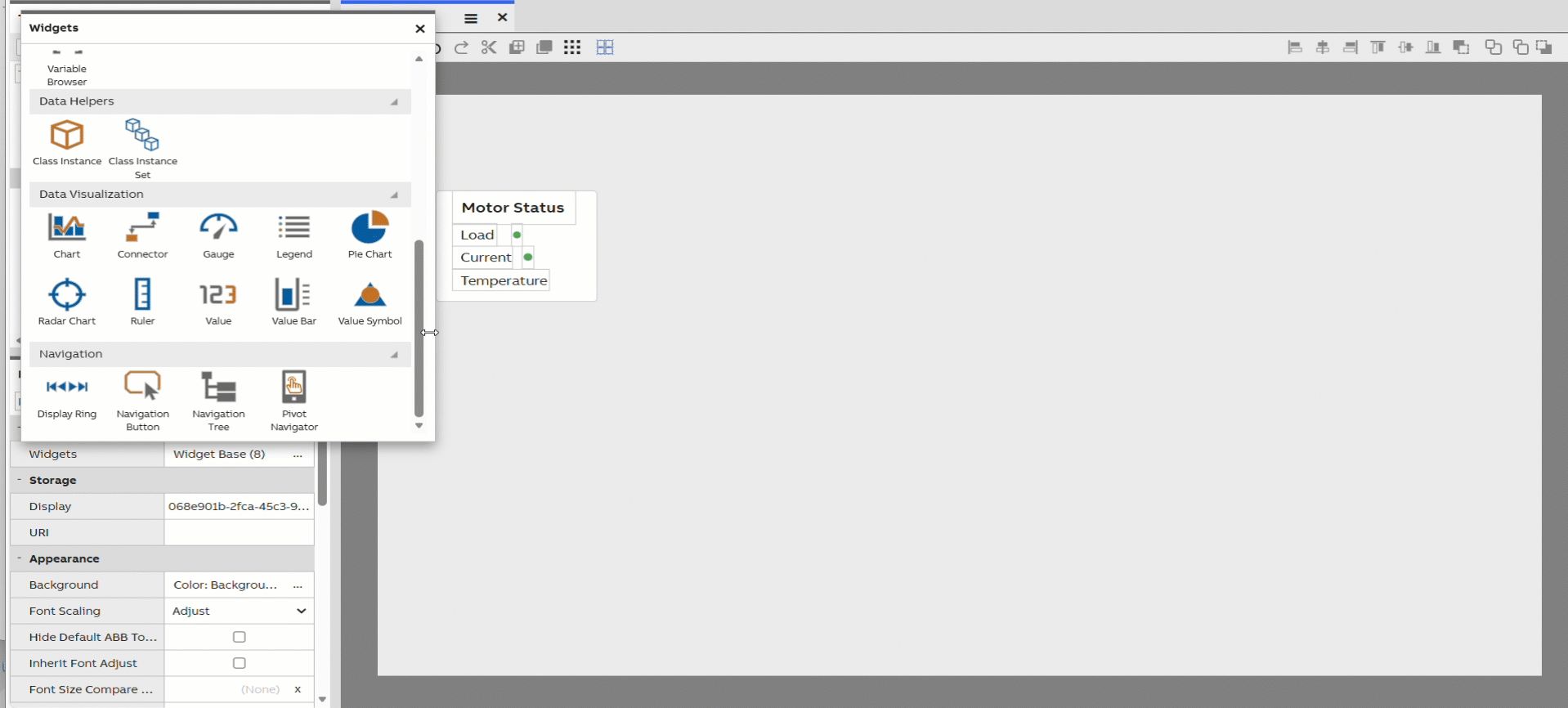
Data Visualization
Value
Value is a simple widget used to display a single data value, passed to it through context. It can utilize a Value Accessor to format the displayed data.
Tutorial: Please see our tutorial of how a simple calculation may be done using value widgets here.
Value Bar
The Value Bar widget is used to display a numerical value as a single bar. You can define the min and max values for the bar, and the bar becomes filled based on the value of the property passed to it. Value bars can be rendered either horizontally or vertically, with an option to flip the direction. If the value passed to a value bar fluctuates, this can be animated in the widget.
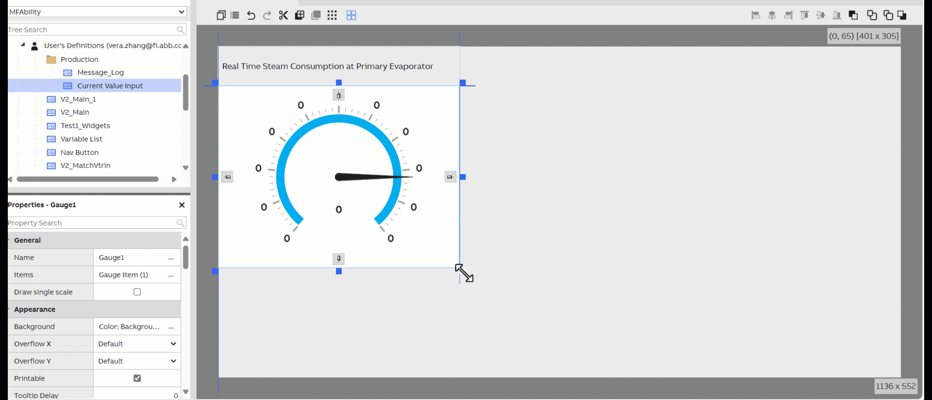
Gauge
The Gauge widget works similarly to the Value Bar widget but with a more skeuomorphic design. It allows you to display numerical values within a range using a needle inside a circular scale. It can also be animated.
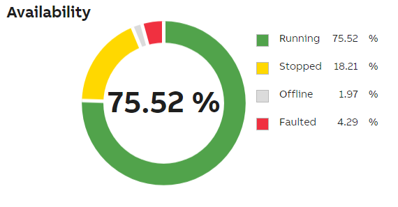
Pie Chart
The Pie Chart widget allows rendering of pie charts. Pie charts are an excellent tool for displaying ratios between multiple values.
Pie Chart can use the Legend widget to explain its contents. A legend can be attached to it from the properties.
The image below shows a pie chart with separate header, value widget in the middle and a legend explaining the pie chart's contents.
Chart
Chart allows you to display graphs on your dashboard, and almost any kind of two-dimensional data with markers. By passing historized properties to the chart, you can render the history values as a graph. It is also possible to render markers on the single data points along the graph or based on custom X and Y property values.
You can enable tooltips to show more detailed information of the data next to your cursor on top of the chart. You can configure this tooltip to show any properties of the data.
Chart has multiple other widgets that support it and to visualize data in a chart we use timebar and ruler(s) with it. We may also add legend that describes the data in the chart. Chart and supporting widgets may be connected together from chart property settings.
Next we will present these supporting widgets.

A chart with associated rulers, a time bar, and a legend.
Please find more information on our Create a trend display tutorial.
Users could create grouped columns via chart widget to compare data slices within a specific time frame.
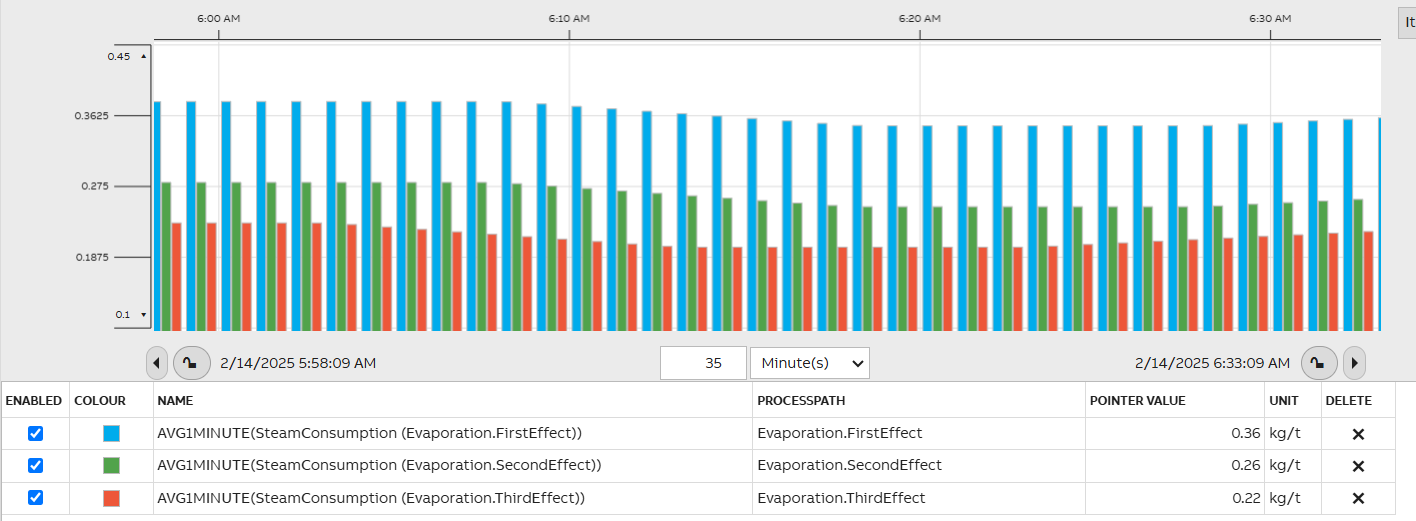
The chart widget also supports the Gantt type for status indication, project timelines, and targeted KPIs in dashboard design.
Legend
Used by both Pie Chart and Chart, the Legend widget allows showing a grid describing all data items in the chart. It is attached to a pie chart or a chart from the corresponding widget's properties, and it receives its data from that widget.
Legend has many appearance options. You can, for example, show a full grid with headers included, or opt to show a simple legend without a visible grid or headers.
Ruler
The Ruler widget is used to create a ruler along the border of a chart. The ruler can be placed on any of the chart's edges, and is connected to it through the chart widget's properties.
Connector
Connector widget draws a connection line between two widgets and from widget property settings you may modify the line settings as wished.
Connector widget provides a visual link between two widgets. It is used to represent process flows or logical relationships. The connector can be attached to the top, bottom, left, or right edge of each widget to define the exact connection point and arrow direction.
Radar Chart
Radar widget displays numerical current value or history data in a radar diagram.
- Allows items from multiple data sources.
- Allows multiple data series.
- Displays live data and listens to Current Value and History Value changes.
- Supports Vtrin Filter calculated data (AVG1MINUTE, COUNT1HOUR, SUM1MINUTE|CALC(Y/60)...) processed on demand on the server side.
- Customizable colors, fonts and various settings for appearance.
Value symbol widget
Value Symbol widget can be used in showing a different image depending on a numerical value.
The widget can:
- Listens to Current Value and History Value changes.
- Supports Vtrin Filter calculated data for History Values (AVG1MINUTE, COUNT1HOUR, SUM1MINUTE|CALC(Y/60)...) processed on demand in the server side.
- Any number of rules can be defined (using a simple syntax 0<y<=1), each rule containing a reference to an image file in the web server.
Data Helpers
Class Instance
Class Instance widget allows you to add a class and chosen instance within that class to dashboard so it can be used as a source for other widgets on the dashboard. This could be used for example with Select widget. An example of this may be read here: Setting current property value to variable.
It is an invisible widget (when you exit the edit mode) and usually placed in a corner of a dashboard not to be in the way.
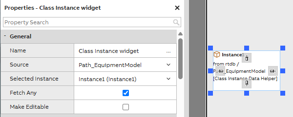
Class Instance general settings example
Class Instance set
Class Instance set allows choosing multiple instances from chosen sources that may be visualized on dashboard. It is useful for example with dashboard grid widget.
Navigation
Navigation button
Navigation button widget allows you to choose a dashboard that will be accessed by clicking the button. Dashboard may be added to button by simply dragging and dropping. After dragging the name of the target dashboard appears as the button text. Text and other settings may be modified under navigation button properties.
Navigation tree
Navigation Tree widget provides a way of navigating between dashboards. It shows navigation tree from a selected data source.
Pivot navigation
Pivot Navigator is a navigation widget for touch displays
- Navigation is based on horizontal swipe action.
- Pivot Navigator is added into a dashboard as a normal widget.
- Dashboards can be added into the Pivot Navigator from various datasources.
- Separate mode for being able to interact with the widget in the dashboard.
Updated 13 days ago