Dashboard formatted Datalist configuration options
Here we go over the most important configuration option for the Formatted Datalist.
Creating the datalist
First we will create a new dashboard, open the widget library and from there choose the datalist widget and drag it on the dashboard. You may adjust the size as you wish to fit the size needed.
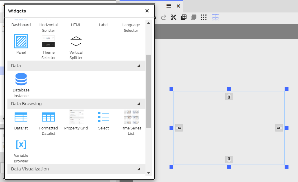
Formatted Datalist widget may be dragged on to the dashboard and place as needed.
Configuring the list
First thing we need to do is select the source (data class) for the data in the list. This may be done from the Properties panel of the datalist. After selecting the source all the properties in the class will be presented on the Formatted Datalist.
Other related properties of the list widget itself that you may modify according to needs:
- Properties. Under Properties you can find the configuration for each displayed data property. Those are described in detail in the next section.
- Default row count determines the default number of rows to be used in the item layout. By default, that is set to three, and it means that the first three values are placed on the first column, and the next three on the second column, etc. It’s called default row count, because it can be overridden in the property specific settings. More on that in the section about data property configuration.
- Column spacing and Row spacing. You can adjust the space between columns and rows with these properties.
- Title. You can define a custom title for the list. If left empty, the name of the data source class is used.
- Column sizes. You can define relative sizes for each column. If not defined, automatic column sizing is used.
Configuring data properties
These configurations are related to the displayed data properties. They can be found when opening the Properties section from the list’s configuration. The configuration logic is quite similar to the default Data list’s logic. On the left side list, you can select the displayed data properties and change their order. On the right side there are options to configure the appearance of the displayed value.
Here are listed the options specific to Formatted data list:
- Grouping property. Use the property for grouping the values. You can have multiple grouping proper-ties.
- Column number. You can force the property value to be displayed in a specific column. If not selected, column placement is assigned automatically.
- Row number. You can force the value to be displayed on a specific row. If not selected, row placement is assigned automatically.
- Date and time formatting. Select the formatting style for date and time values. Selectable only for date values.
- Date and time formatting for grouping. If a date property is used for grouping, you can configure a different formatting for it. For example, you might want to group values by date only, and not time, because that would result in too many groups. By using different formatting, you can still display the time value on the item itself. In Image 1 the same date property is formatted differently for grouping (date only) and displaying on the item (time only).
- Text alignment. Horizontal alignment for the property value.
- Vertical text alignment. Vertical alignment for the property value.
- Show property name before value. You can display the property name as a title before the value. This might be useful, if the value by itself is not self-explanatory.
Font style. Select the font style for the property value. - Font style. Select the font style for the property value.
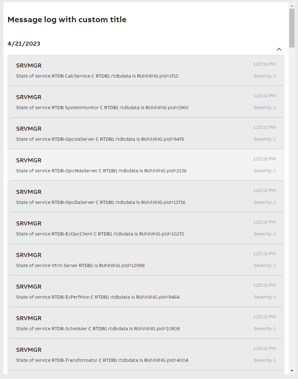
Image 1. Formatted data list widget configured to display Message Log data.
Editing data on Formatted datalist
We can allow editing of data from the datalist property settings. Find property called "Editing" and enable this feature. This allows also manually adding data to datalist.
Deleting data from datalist
Deleting events from datalist may be done by right-clicking on top of the data you want to delete. This will open a small menu, where delete option is.
Updated 6 months ago